Brunswick Brick Mansion- Part Two!
The transformation of a 200 year-old brick building into seven tiny, modern apartments… ROUND TWO!
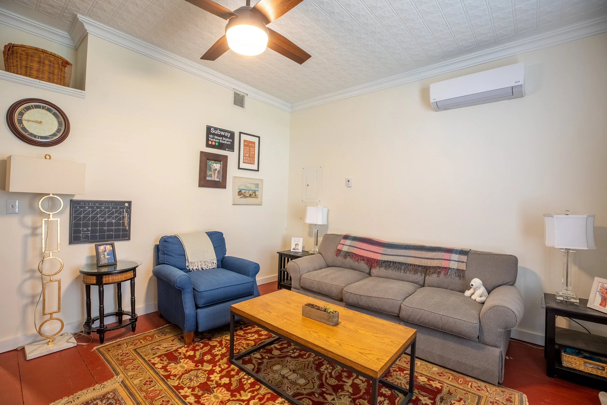
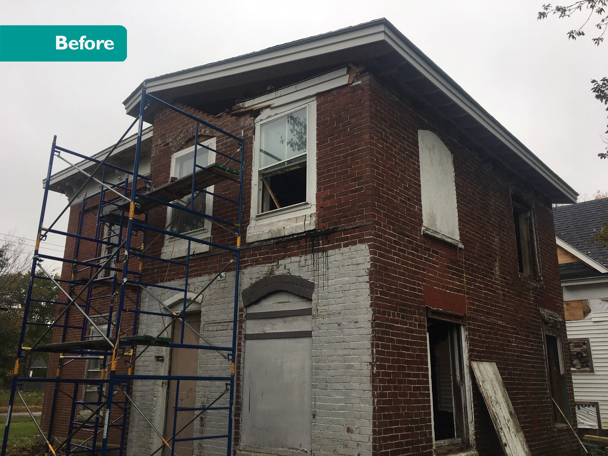
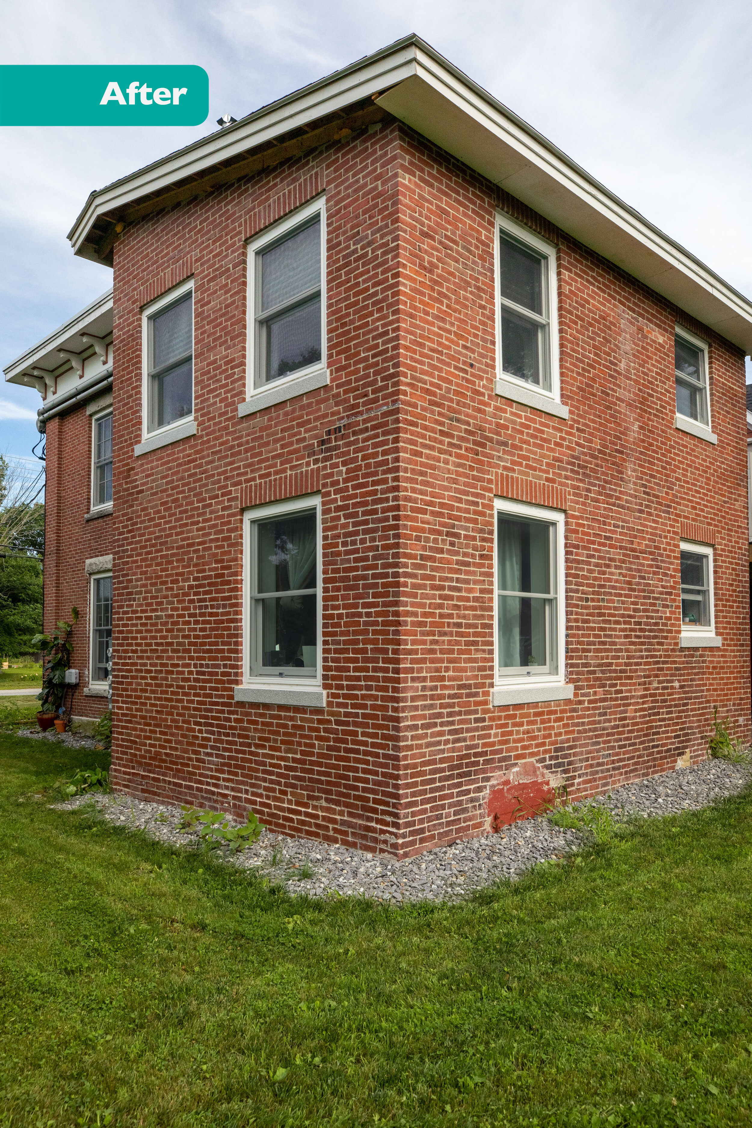
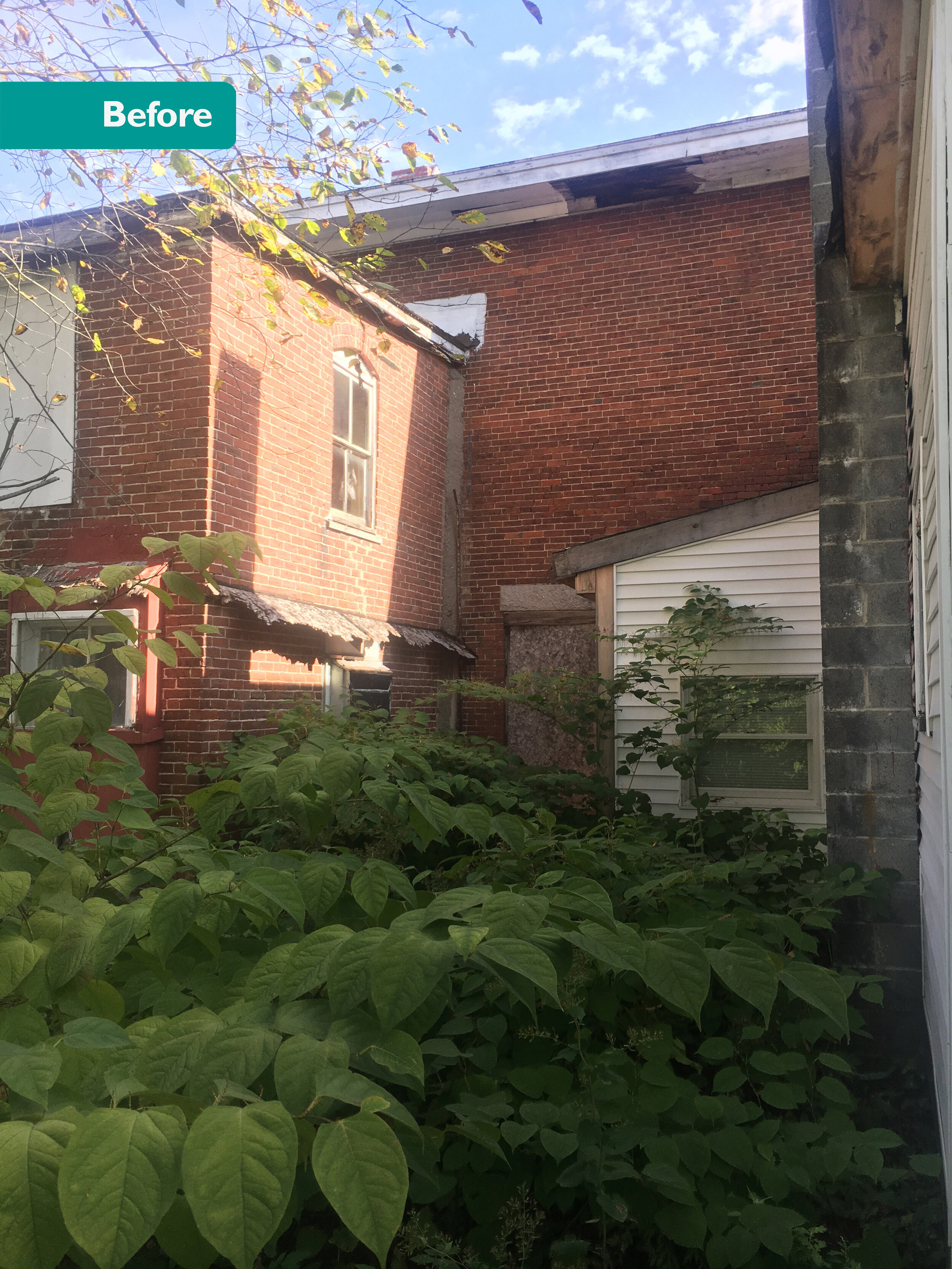
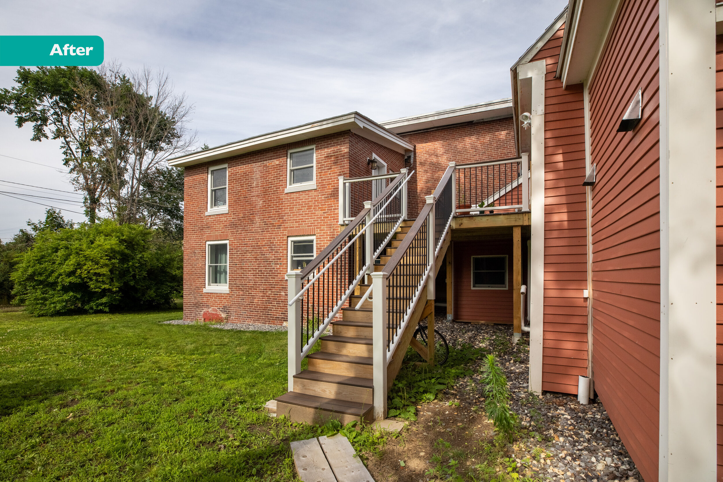
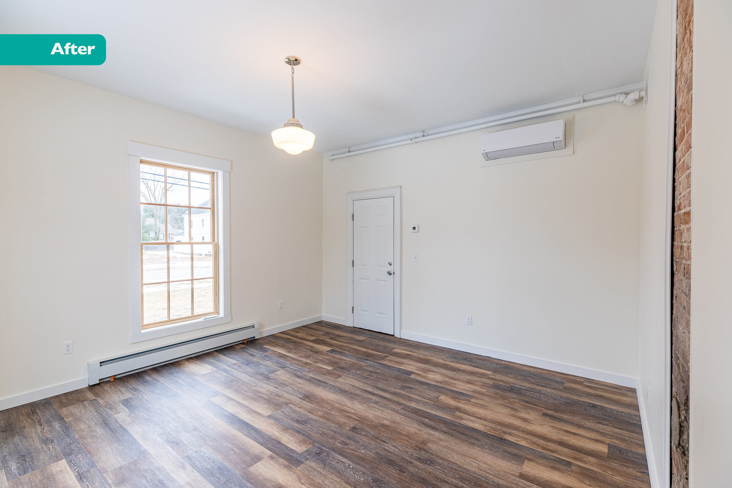
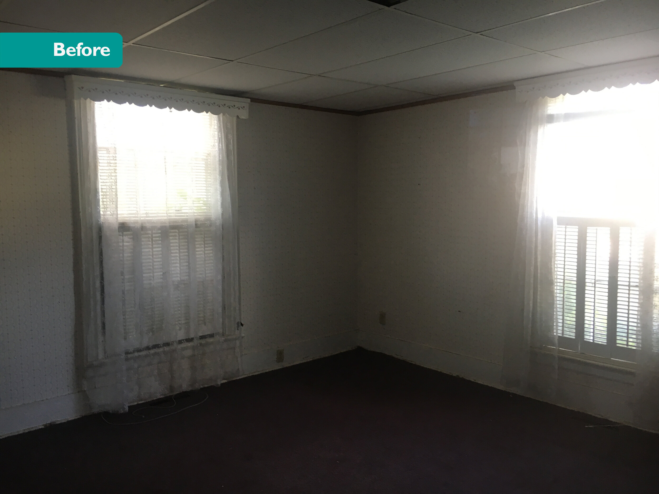
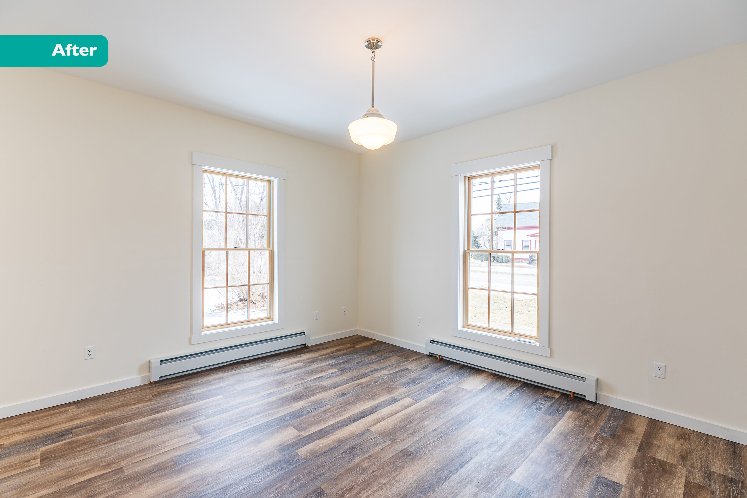
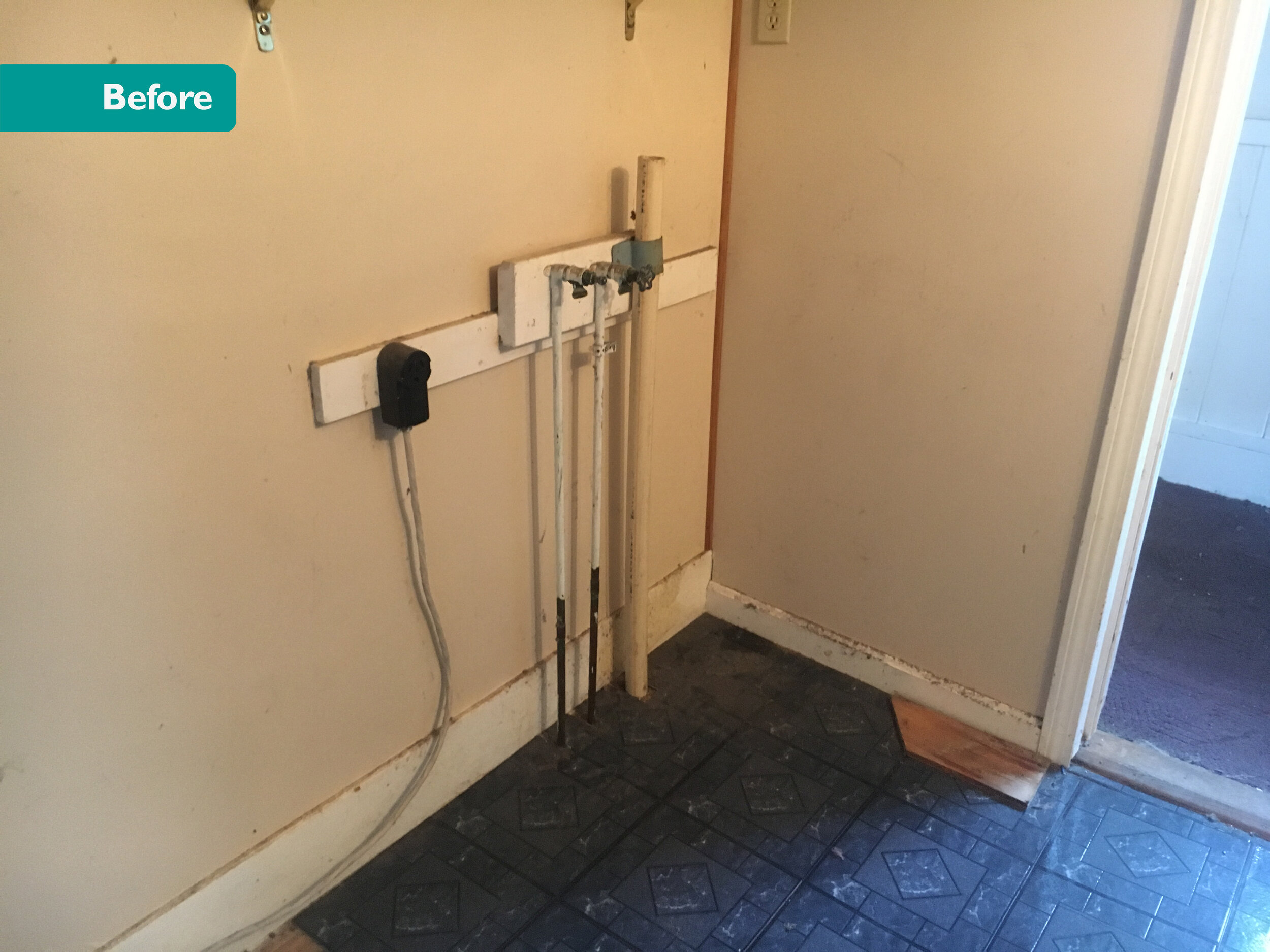
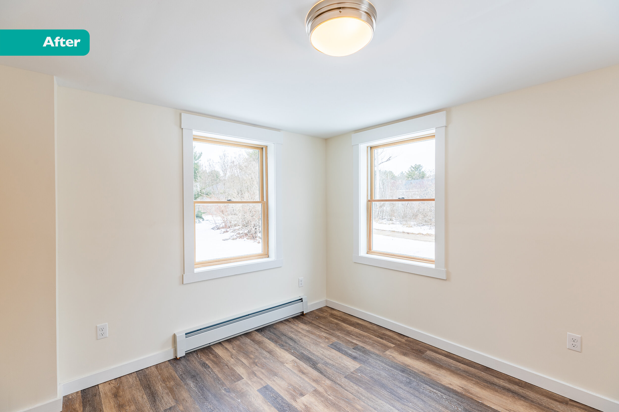
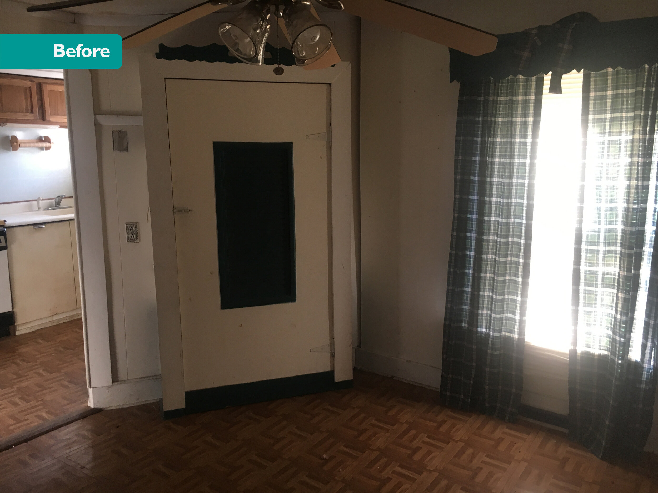
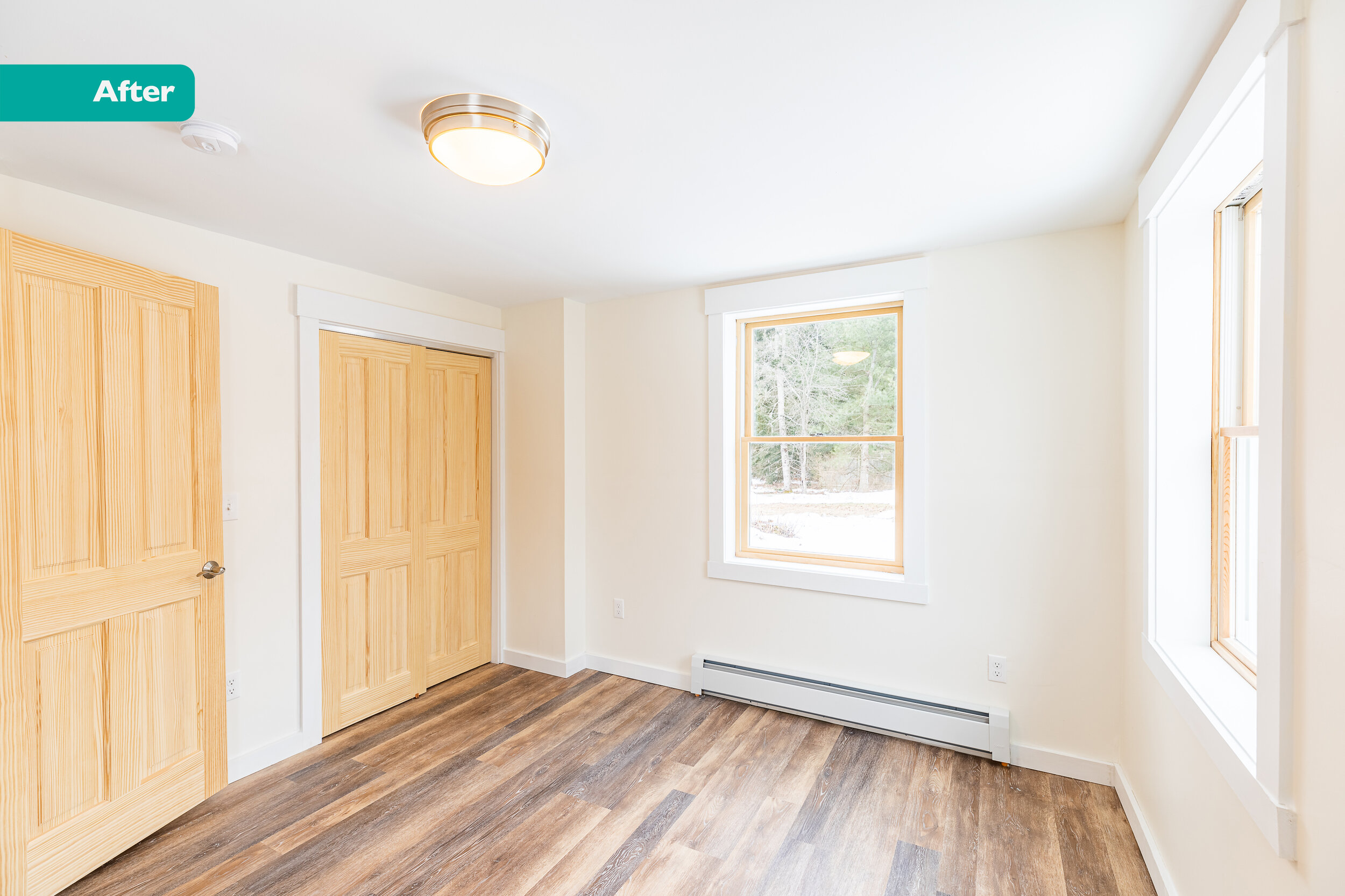
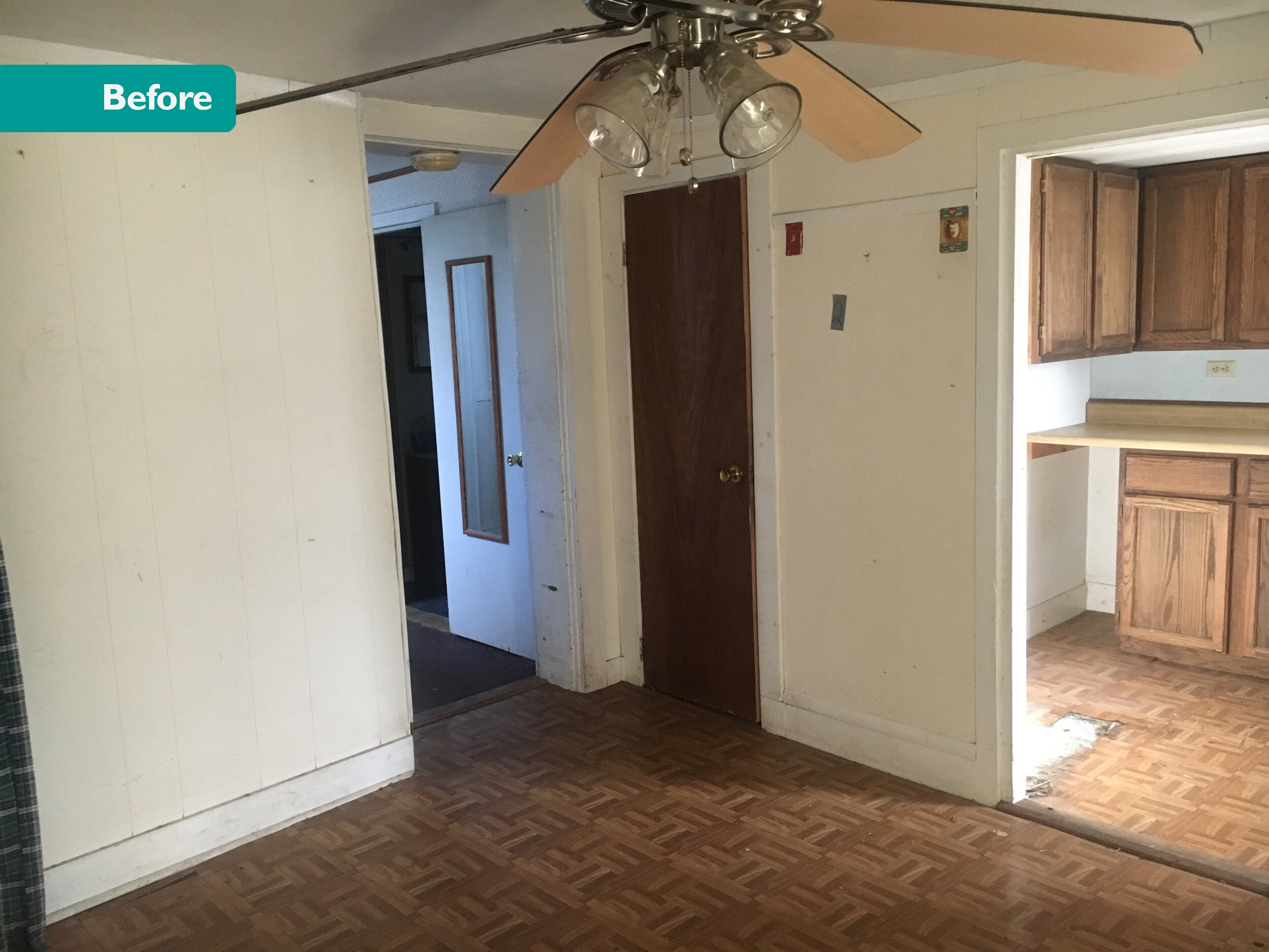
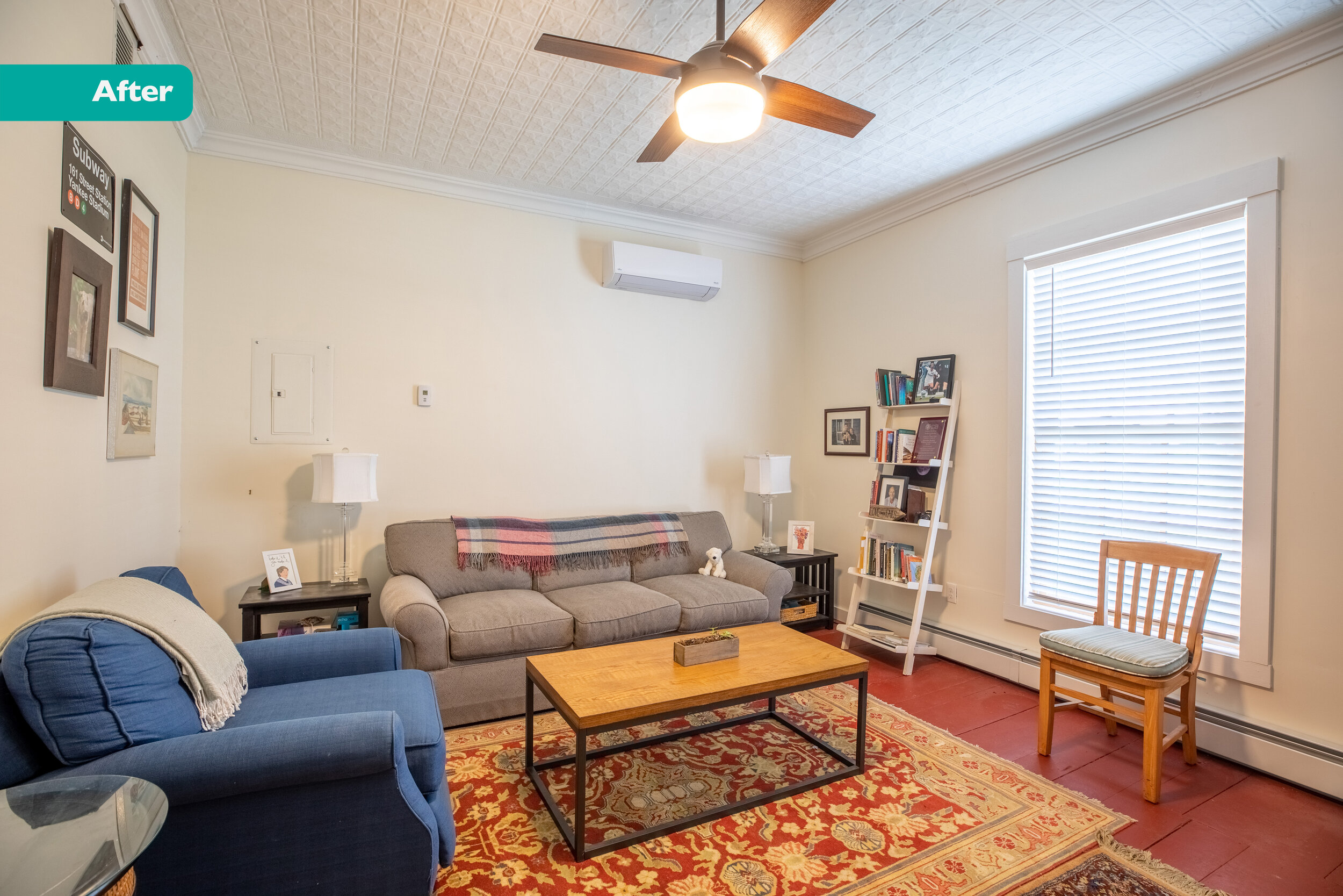
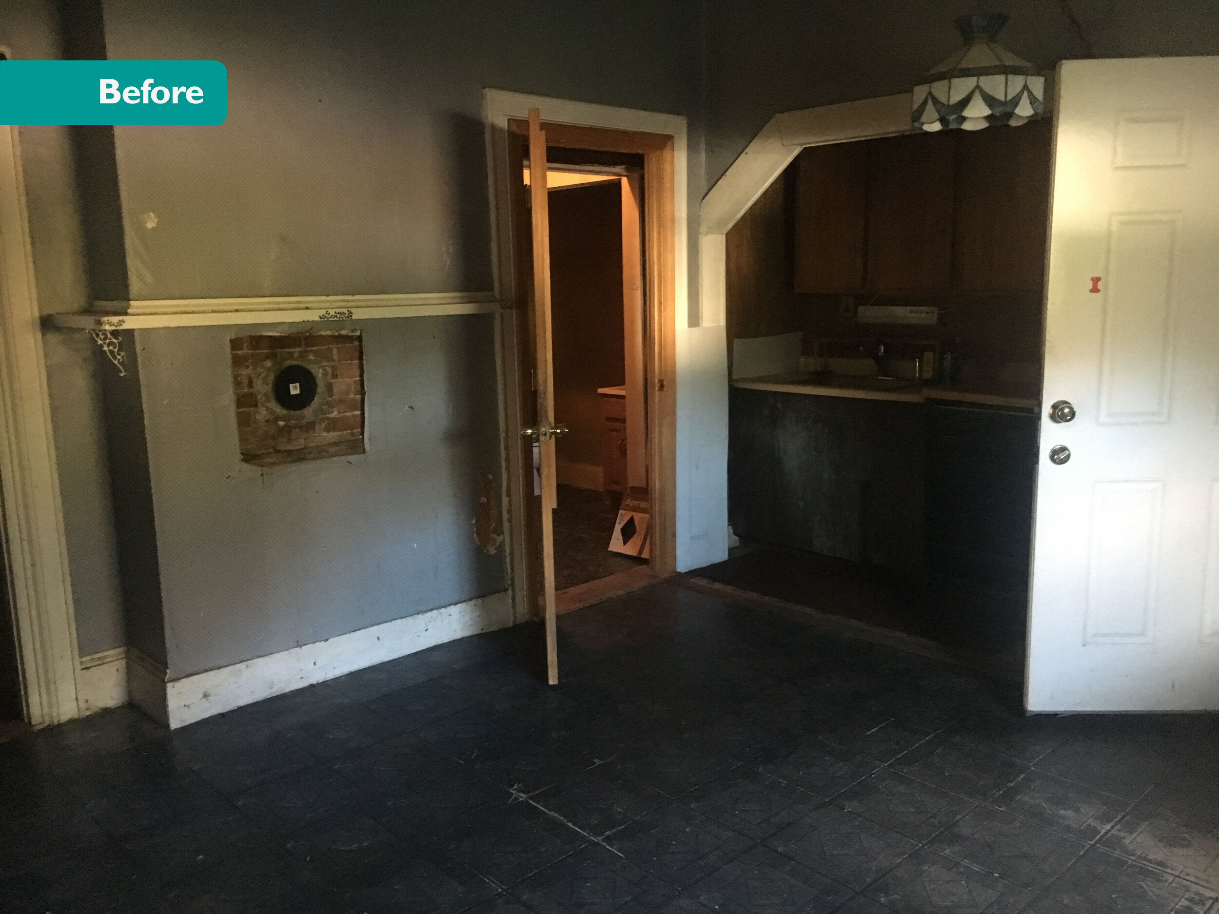
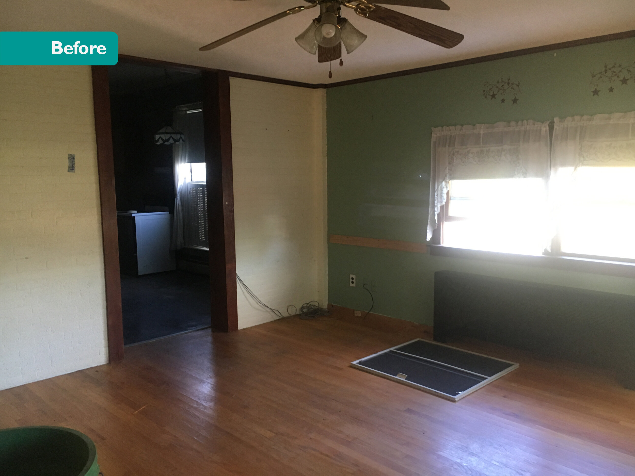
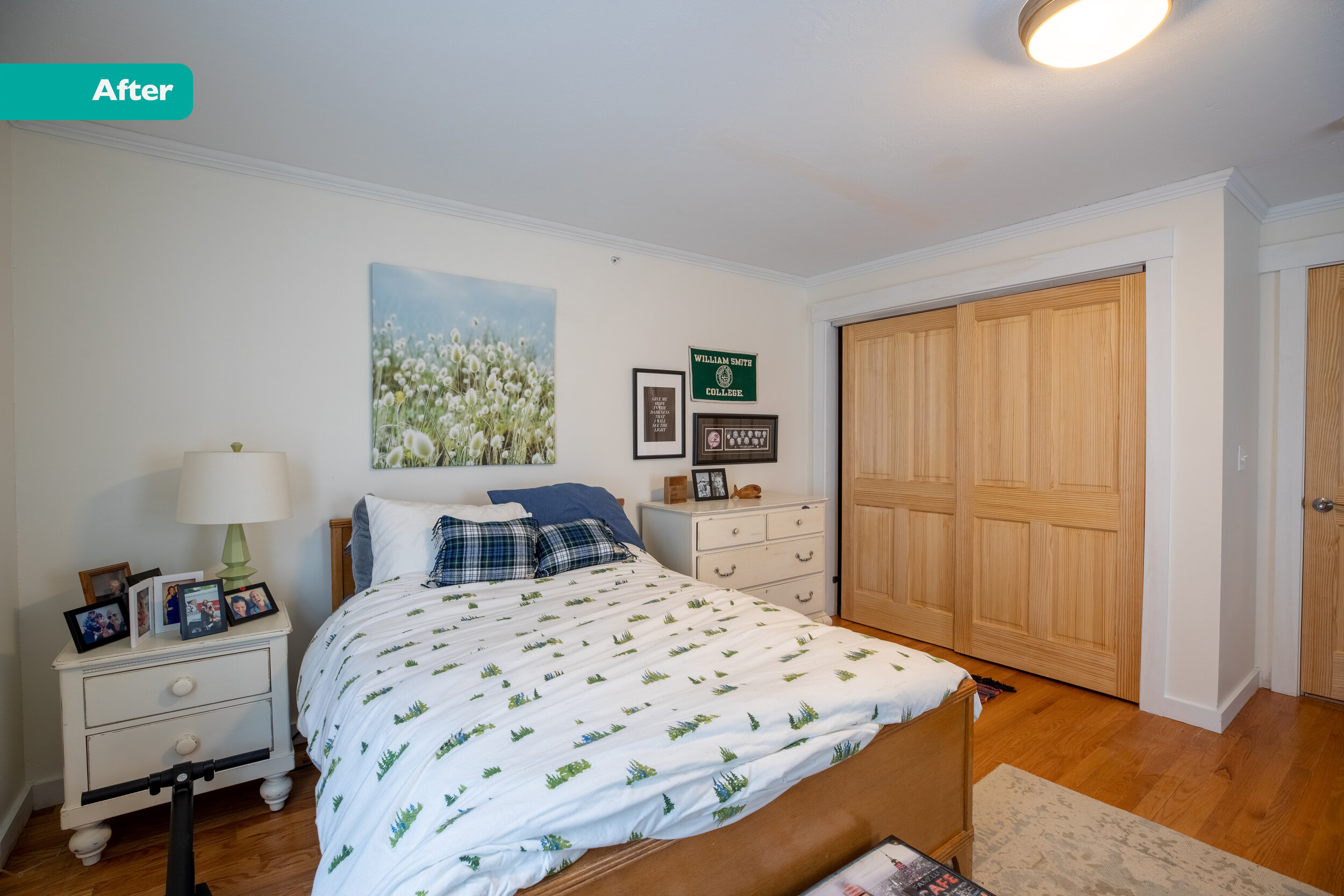
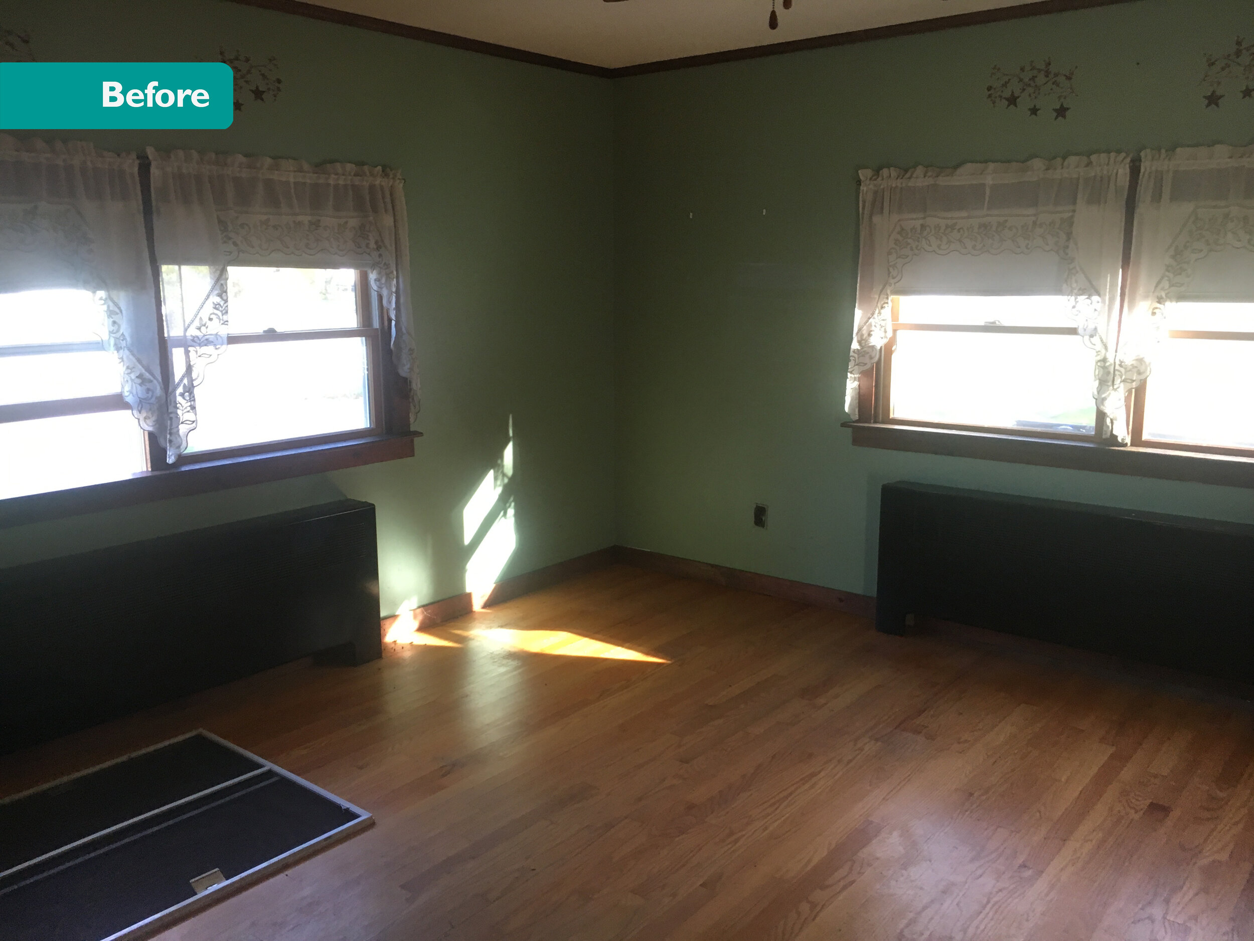
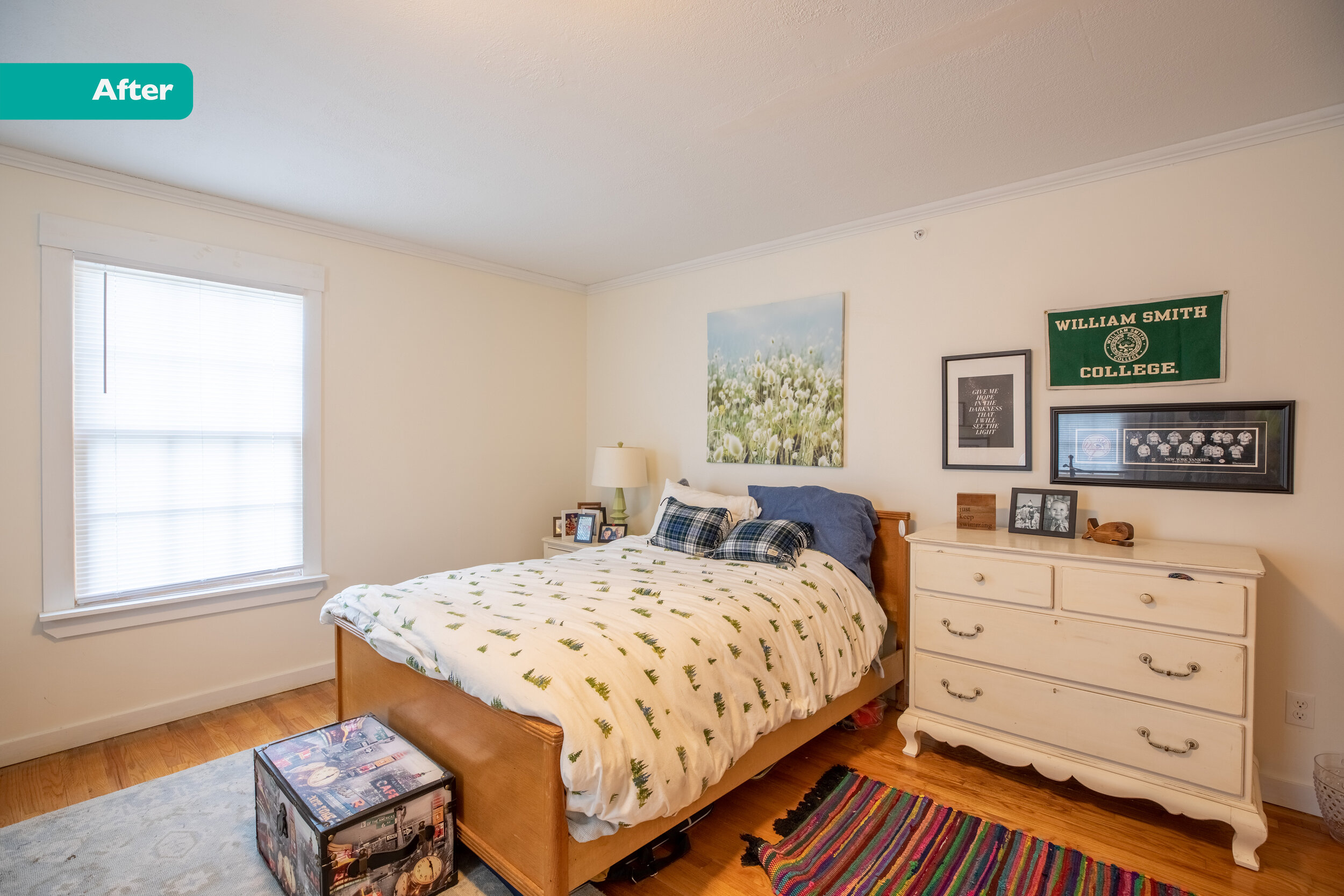
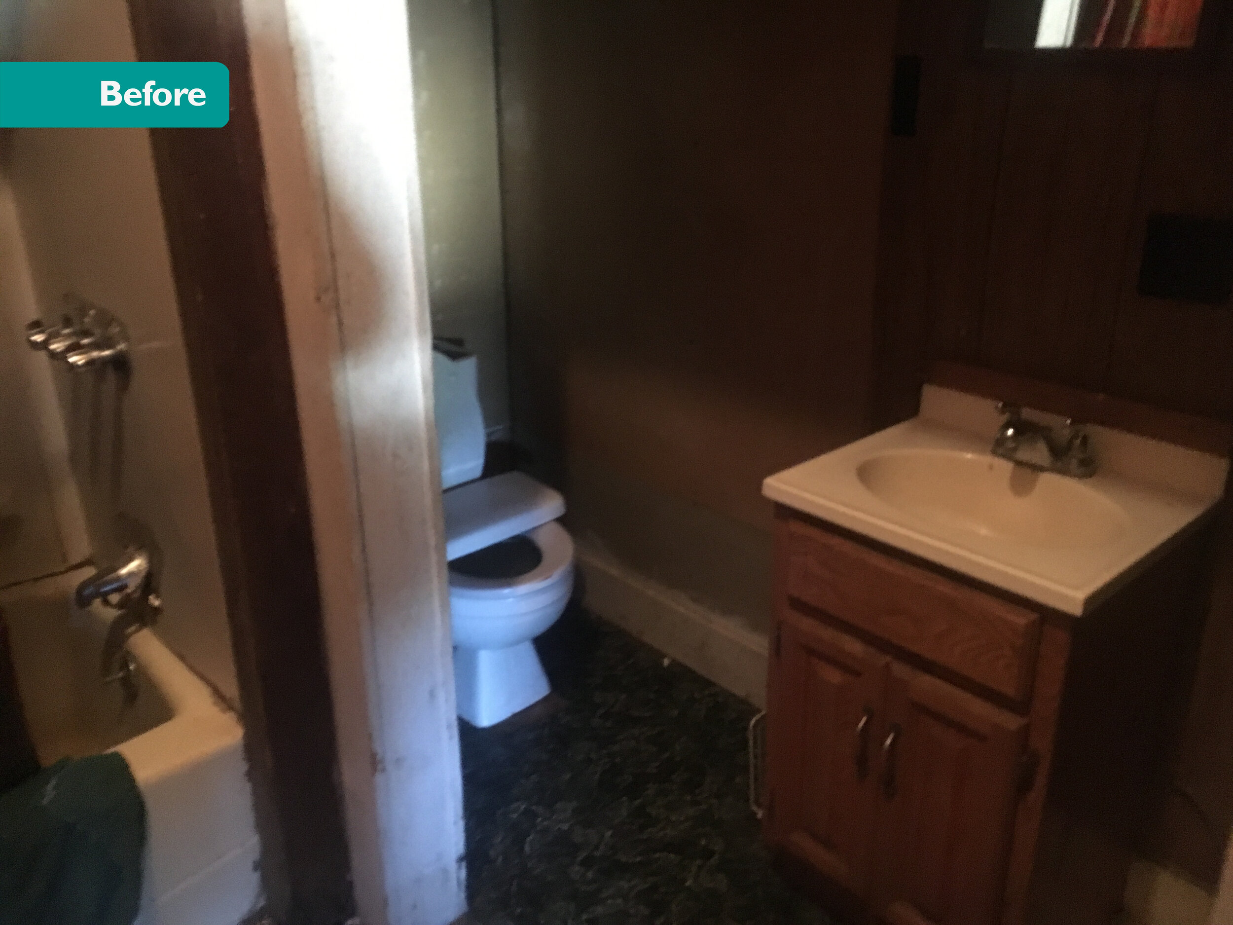
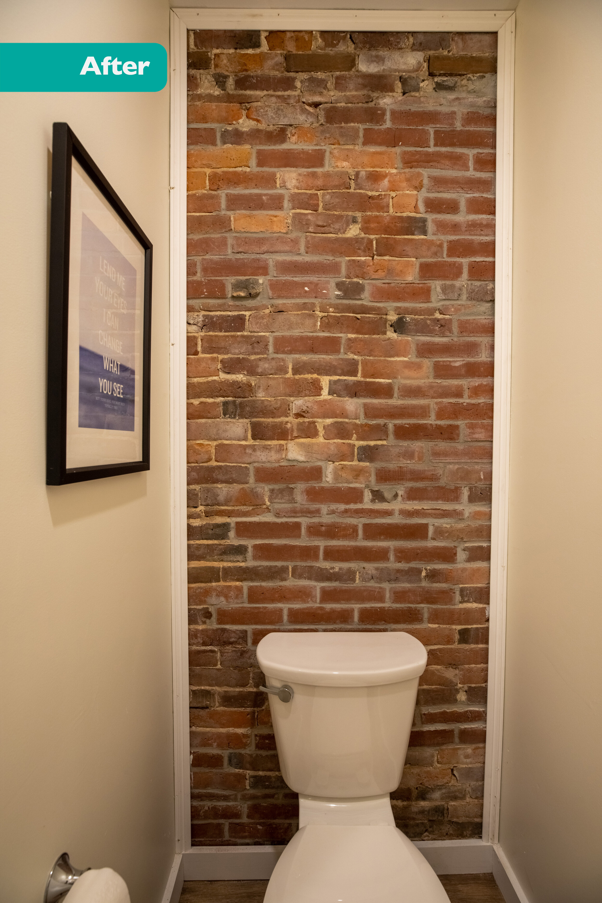
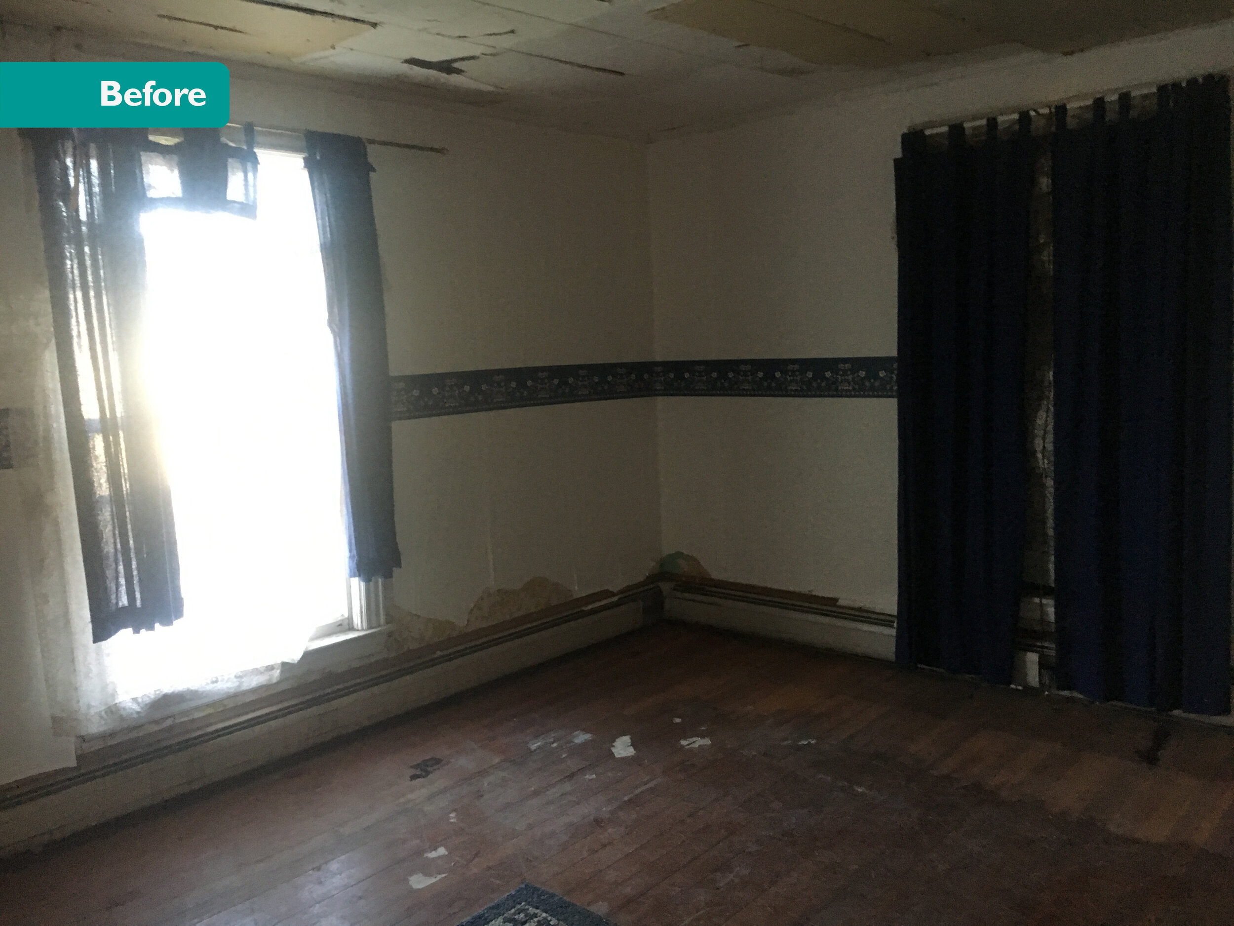
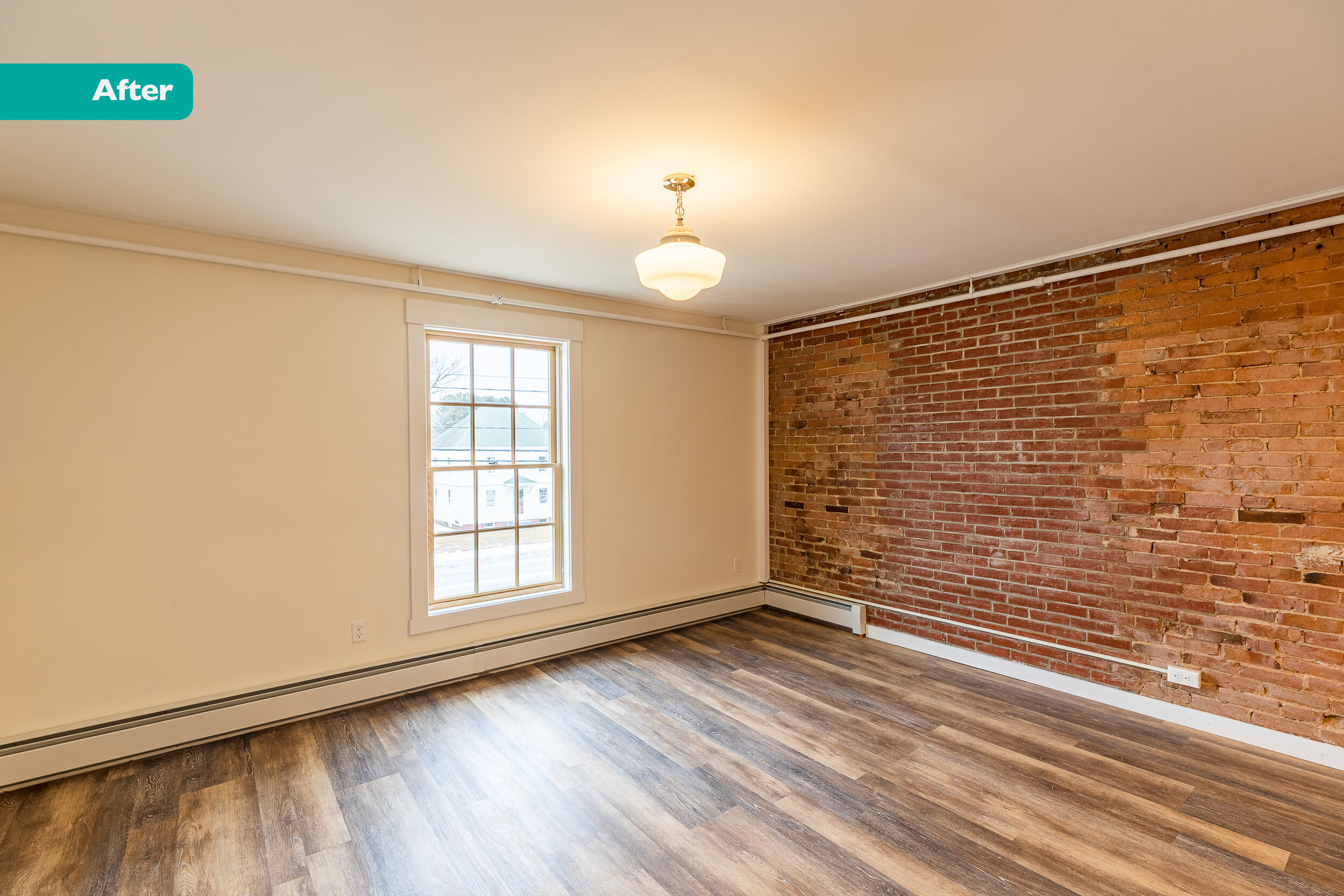
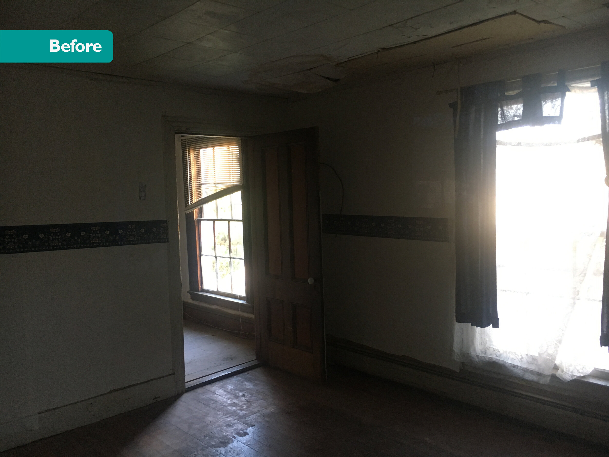
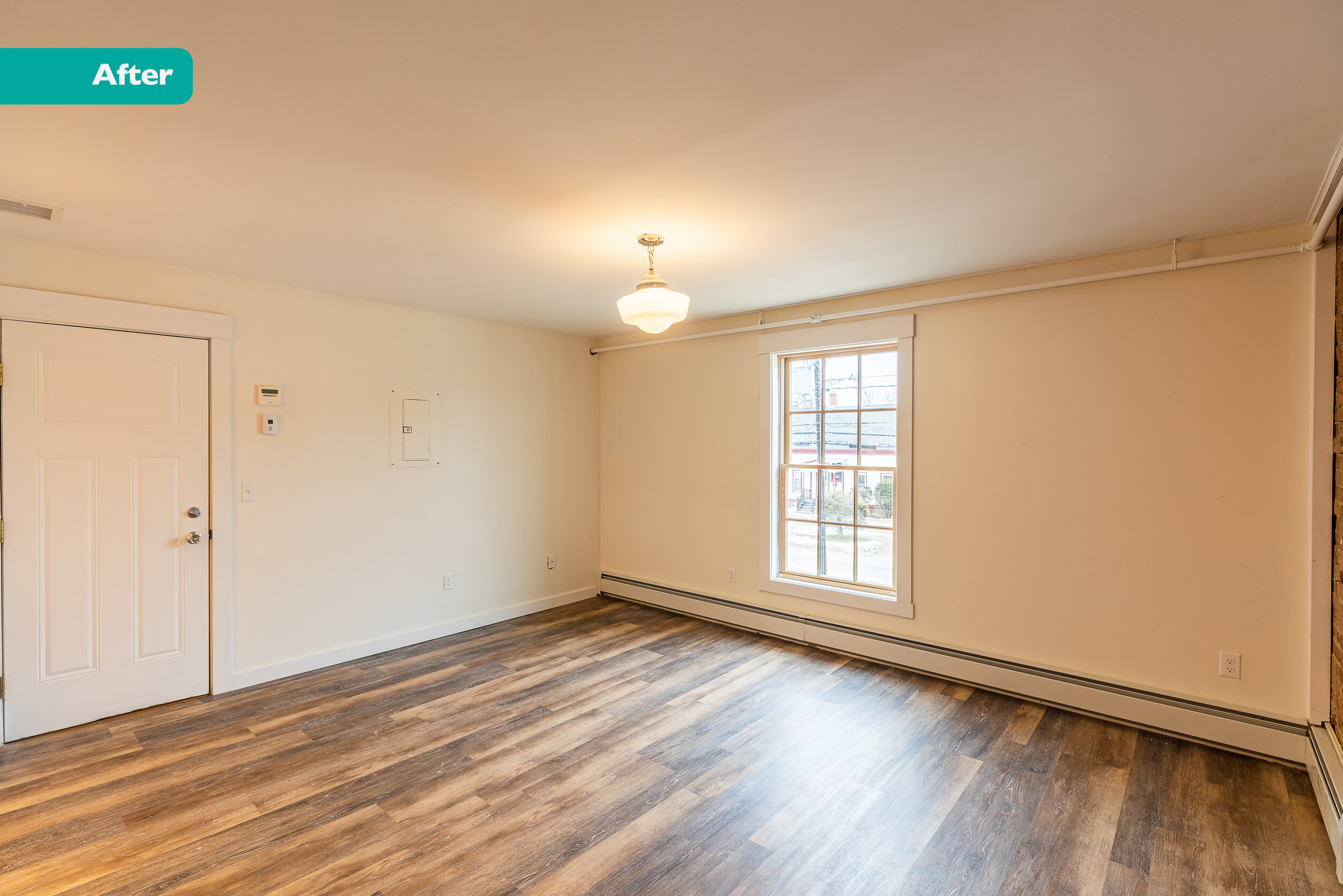
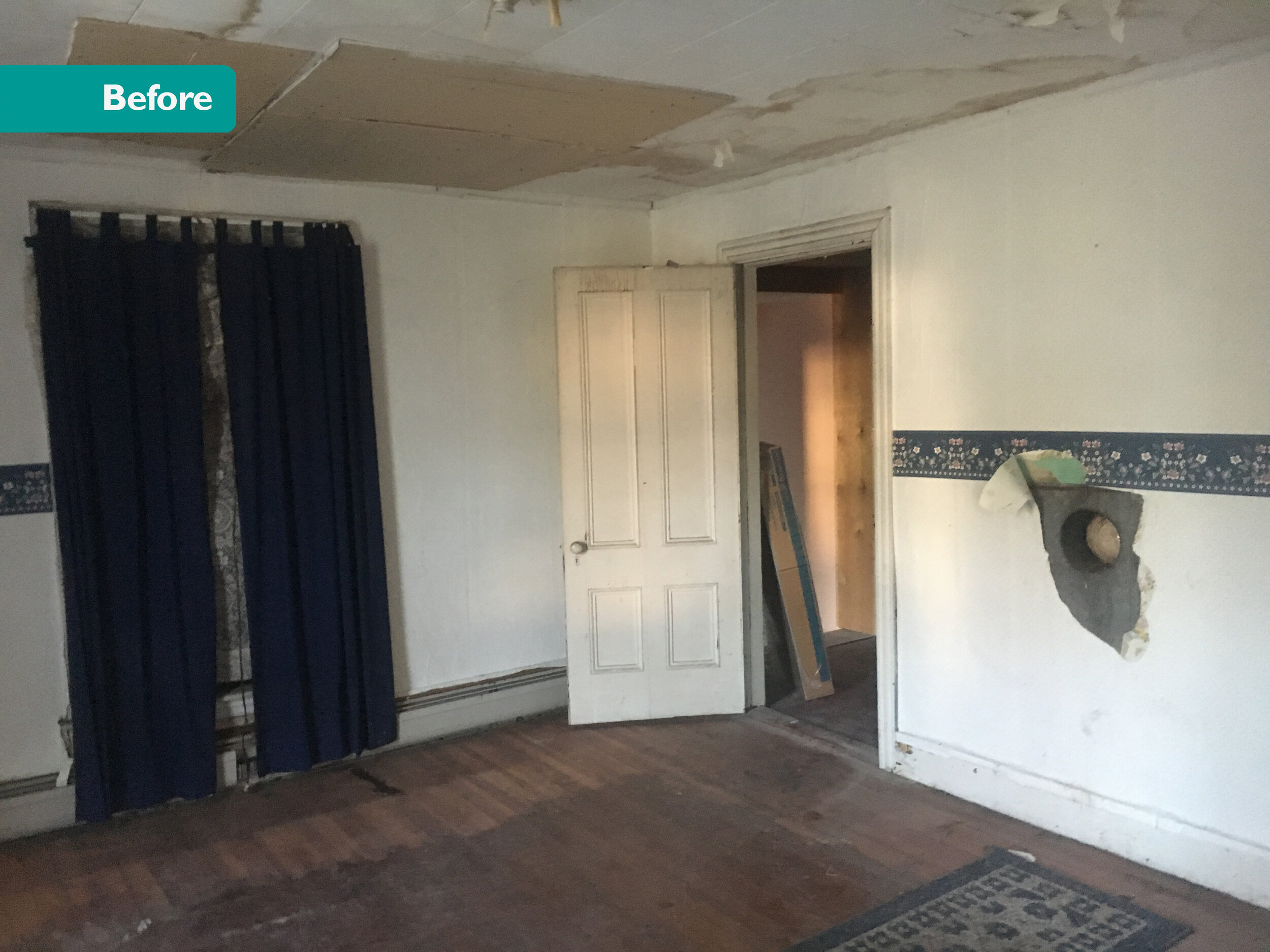
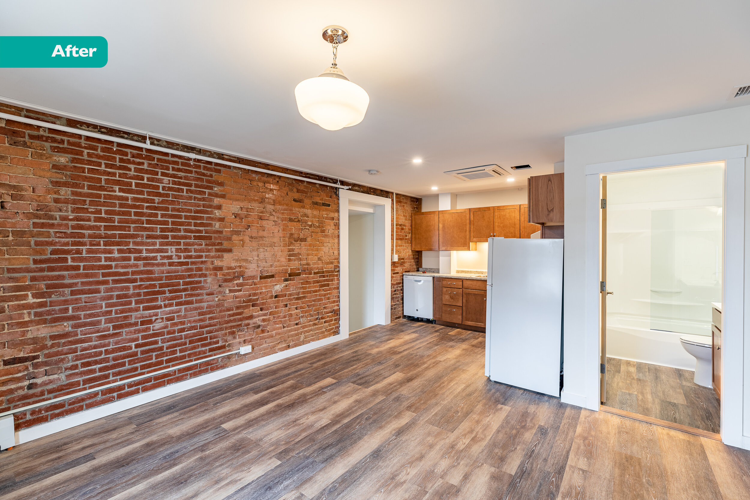
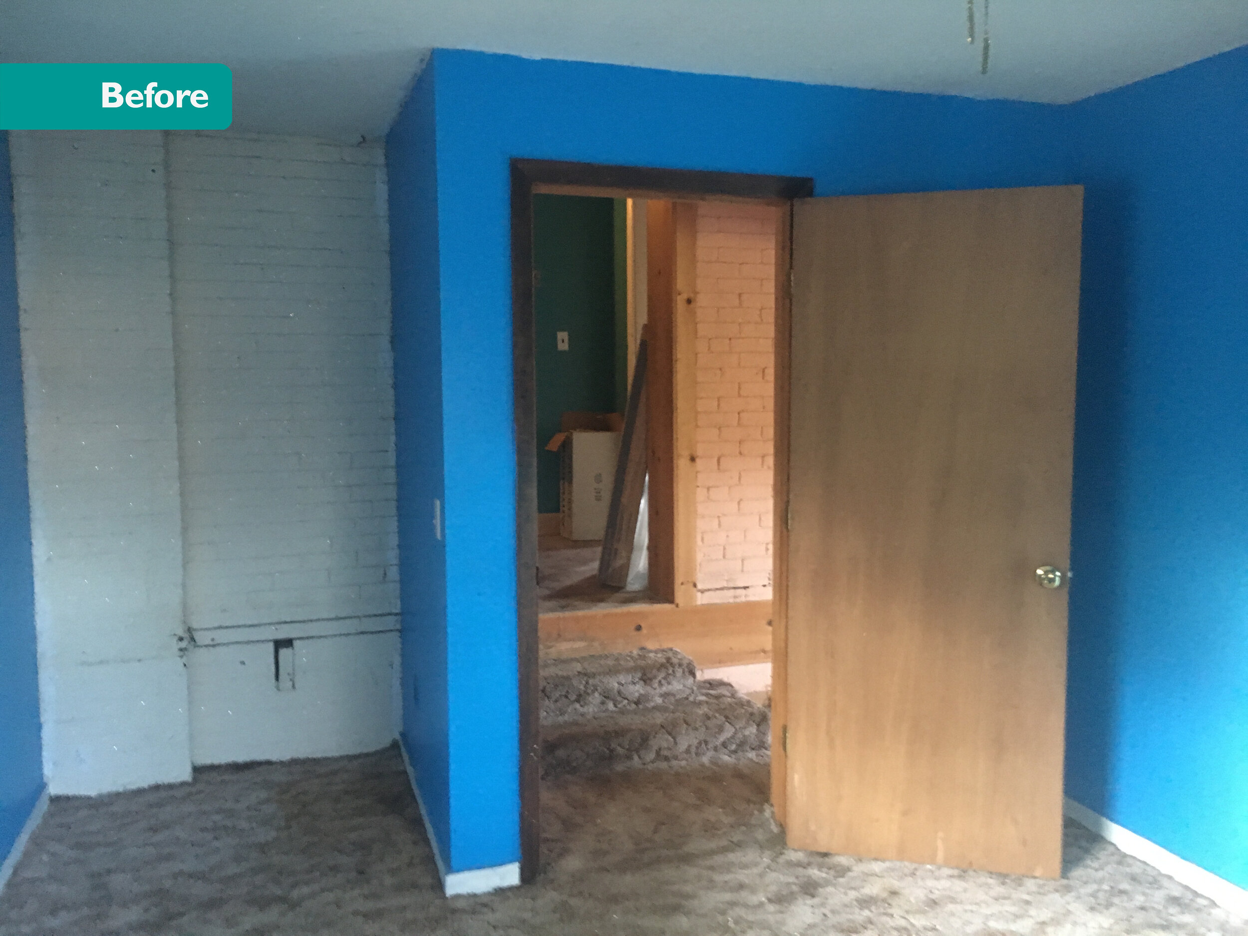
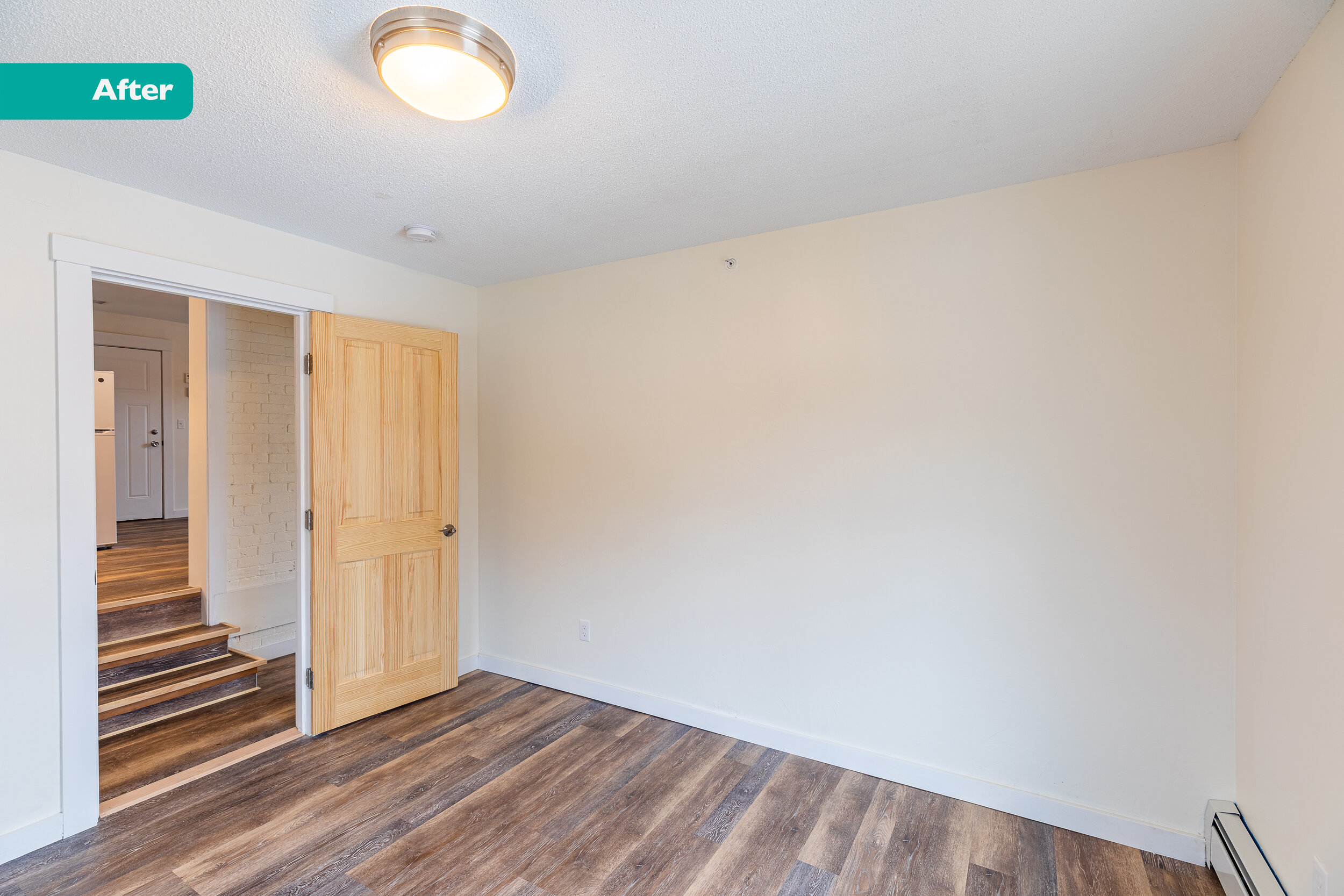
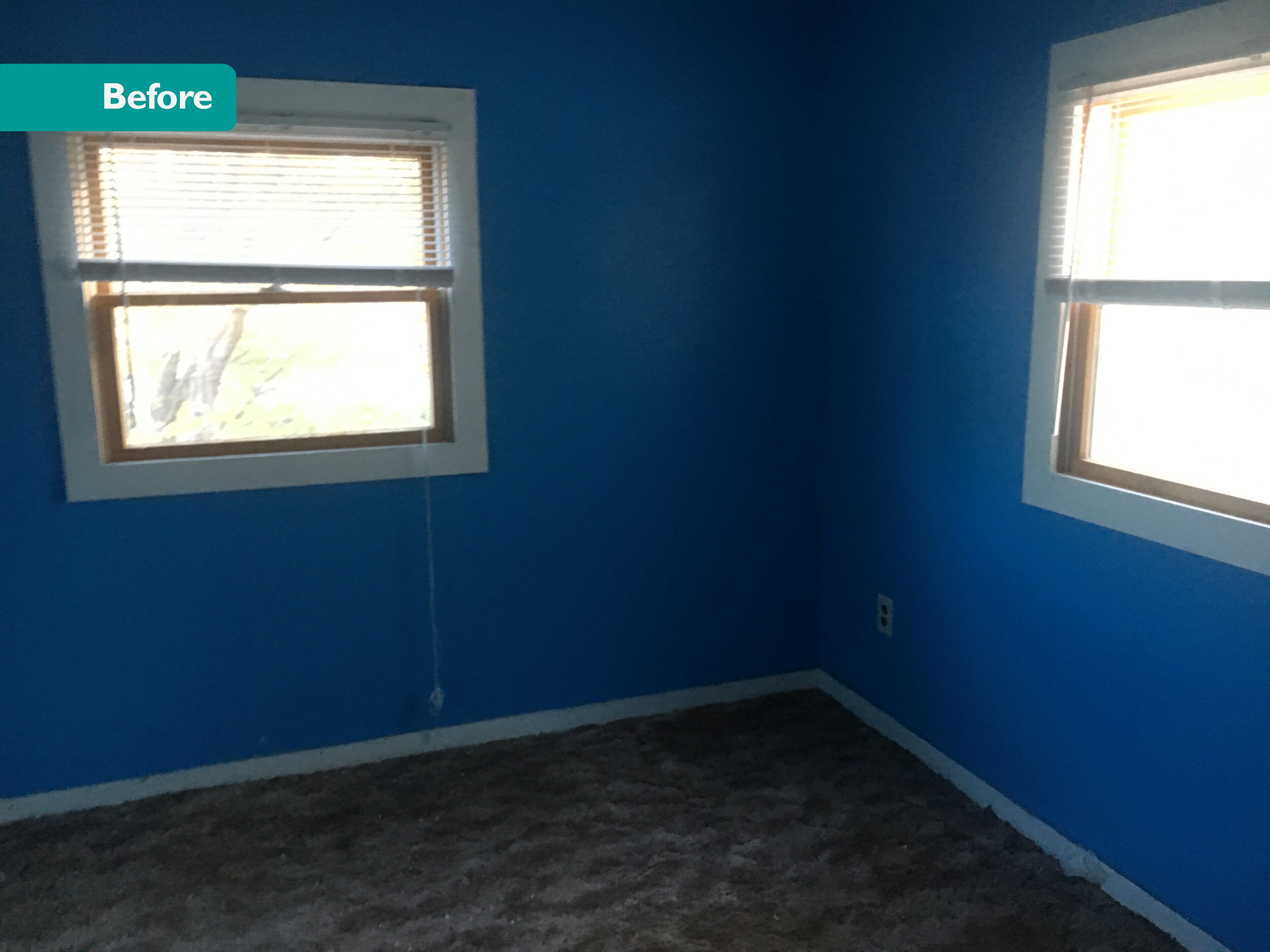
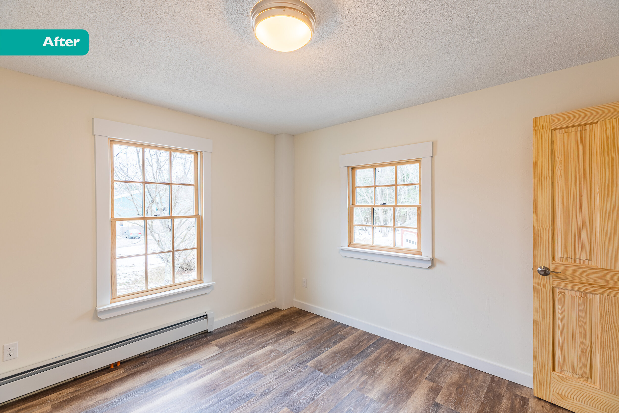
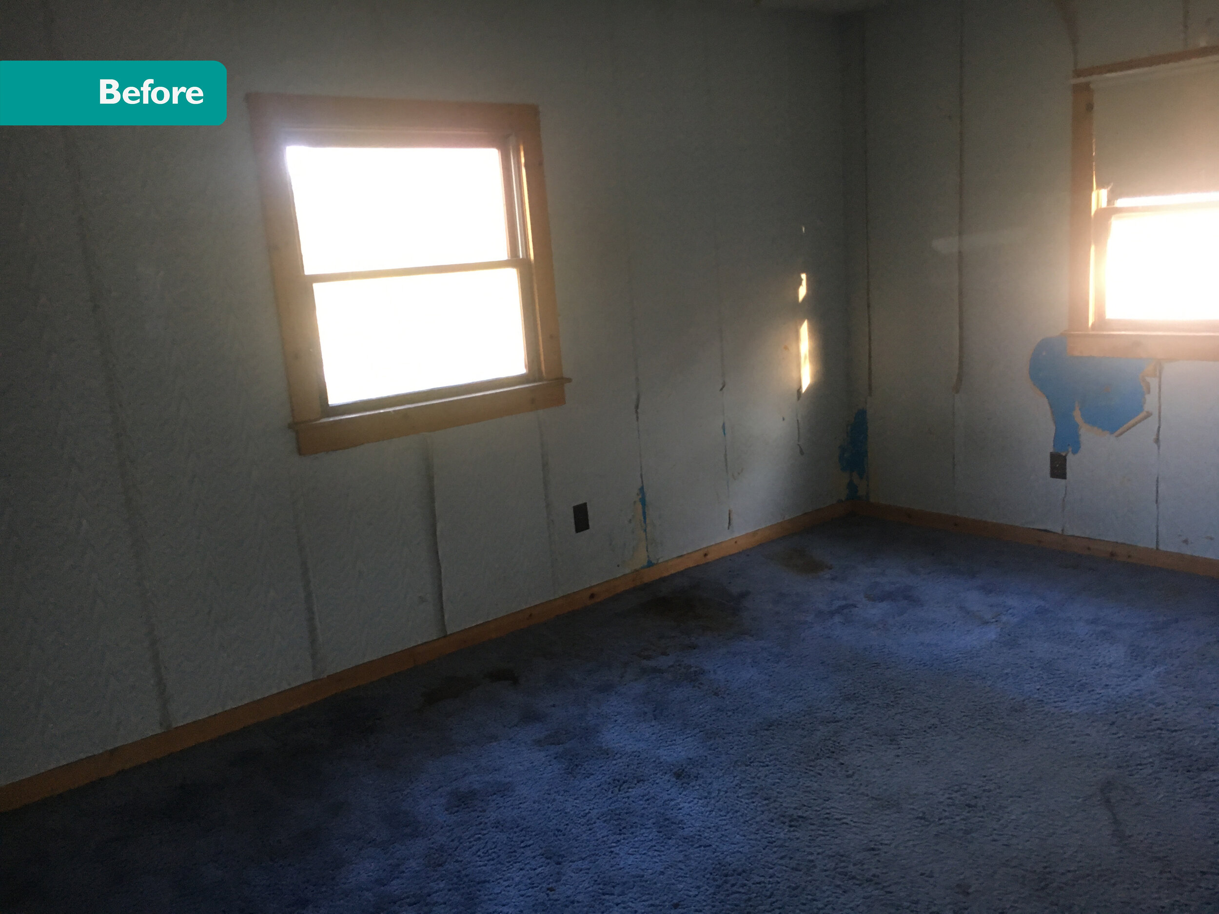
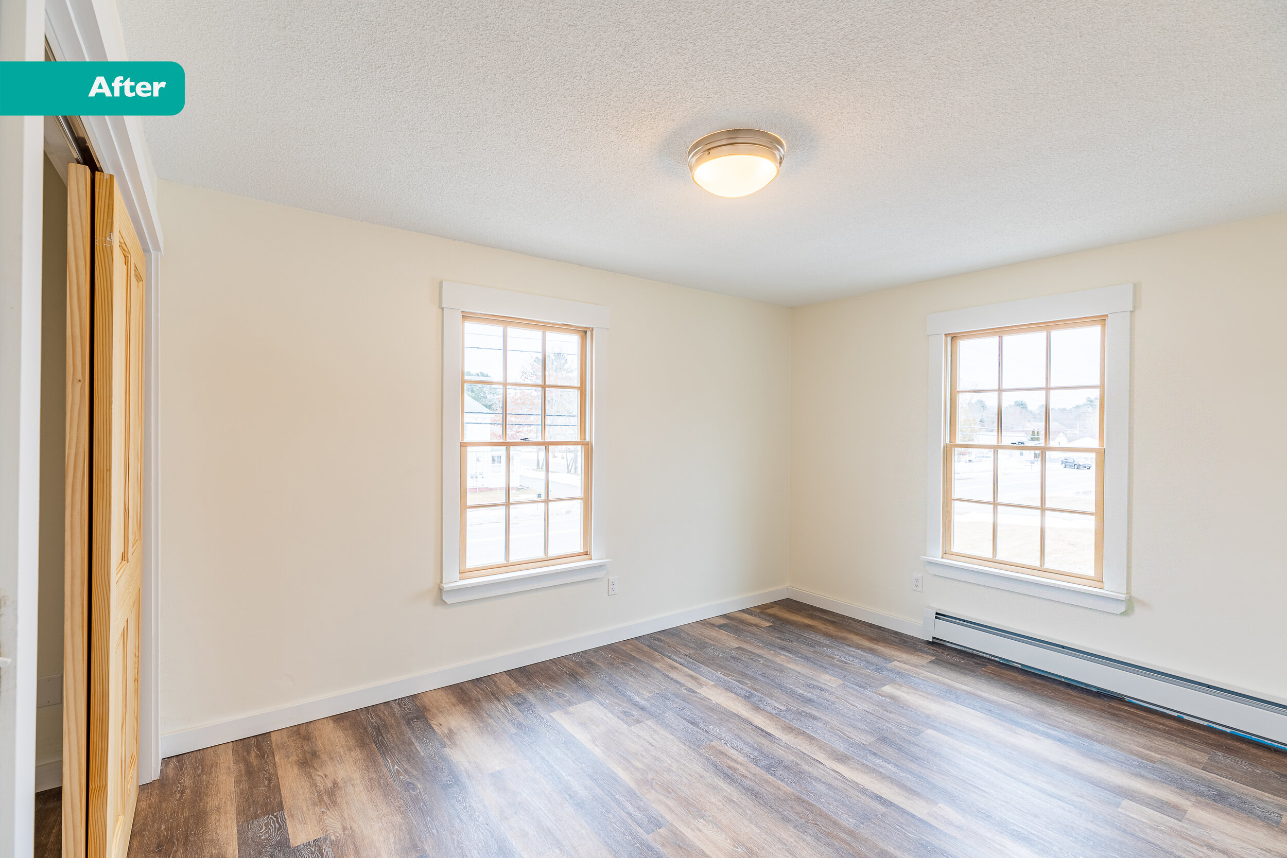
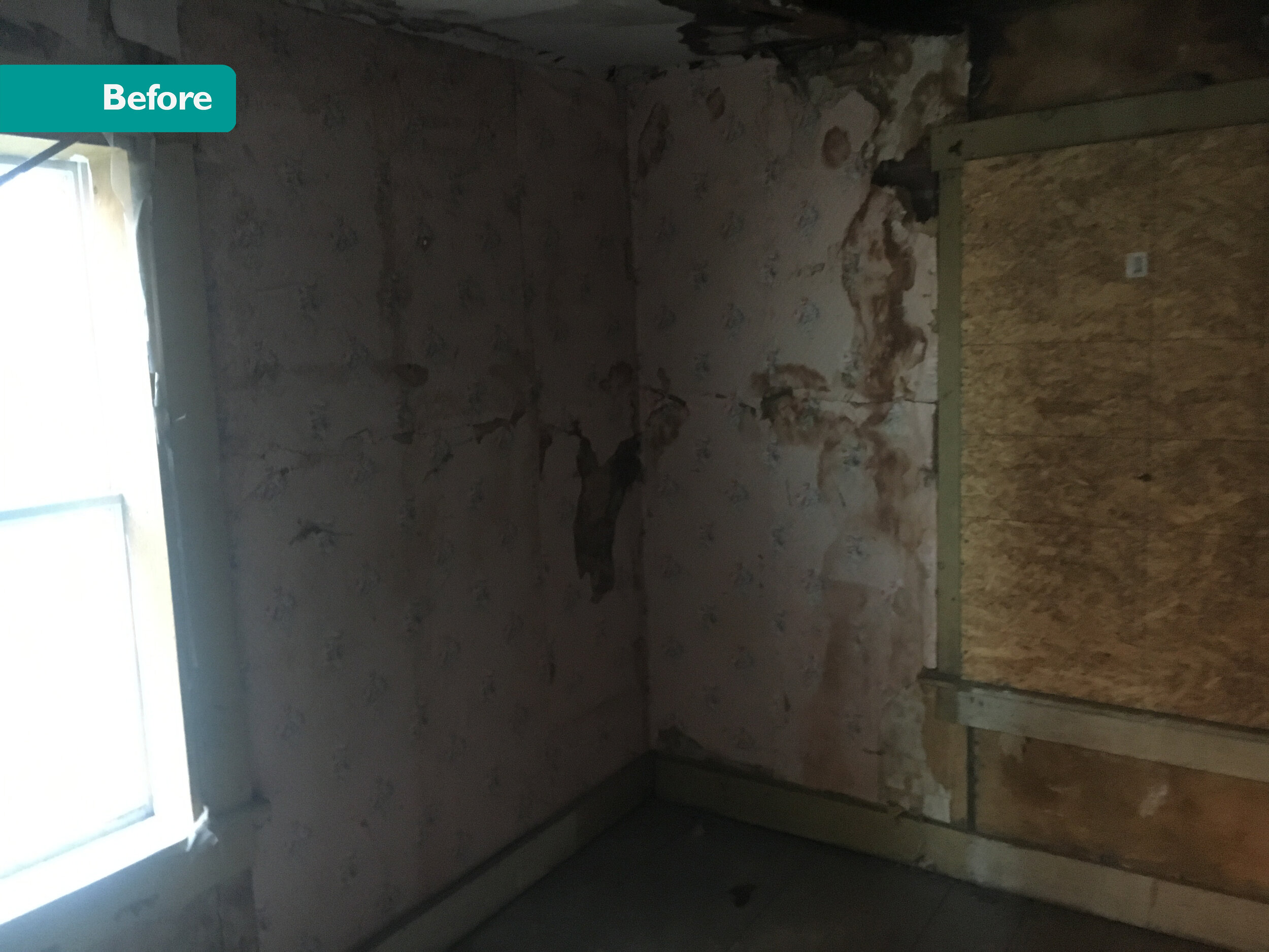
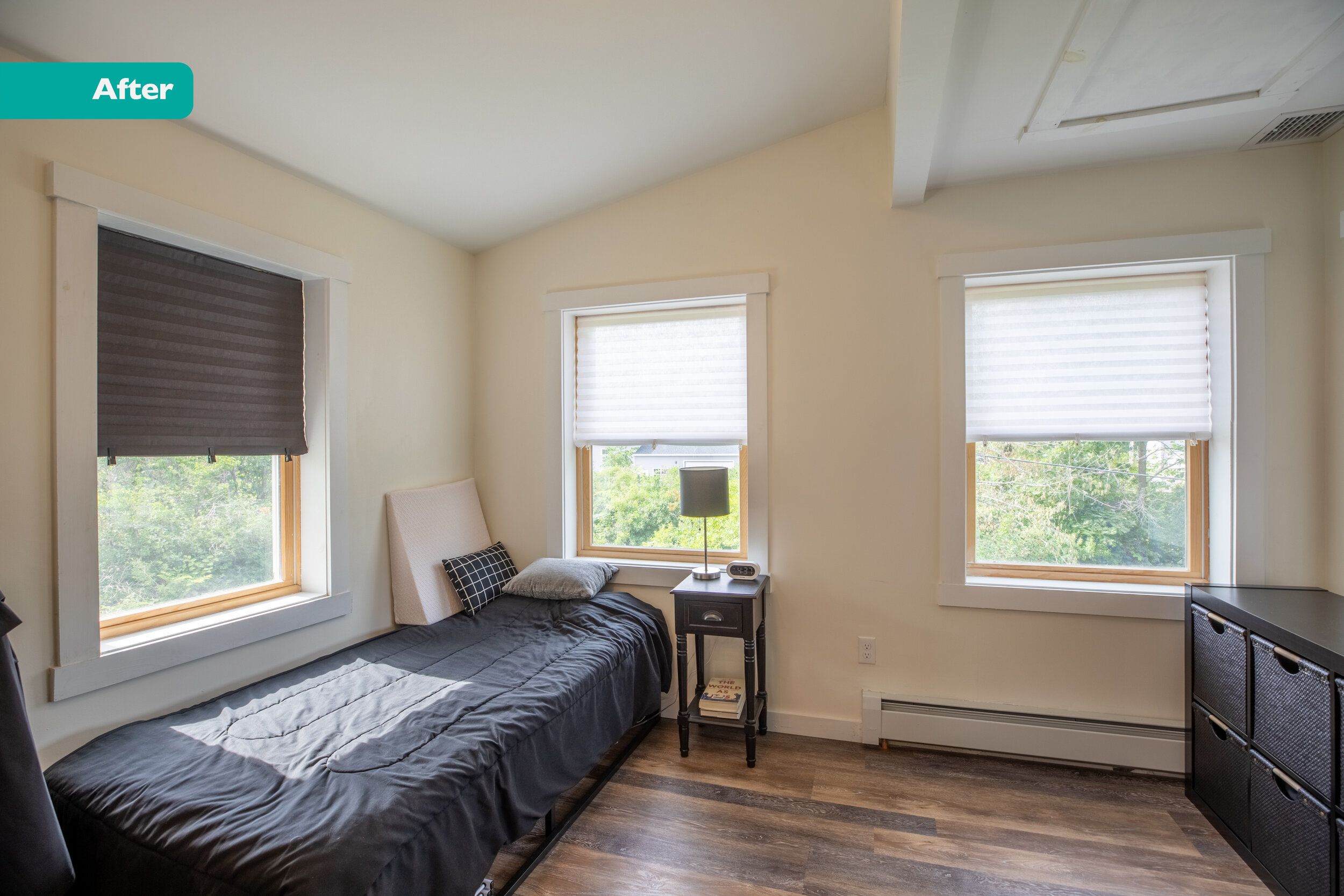
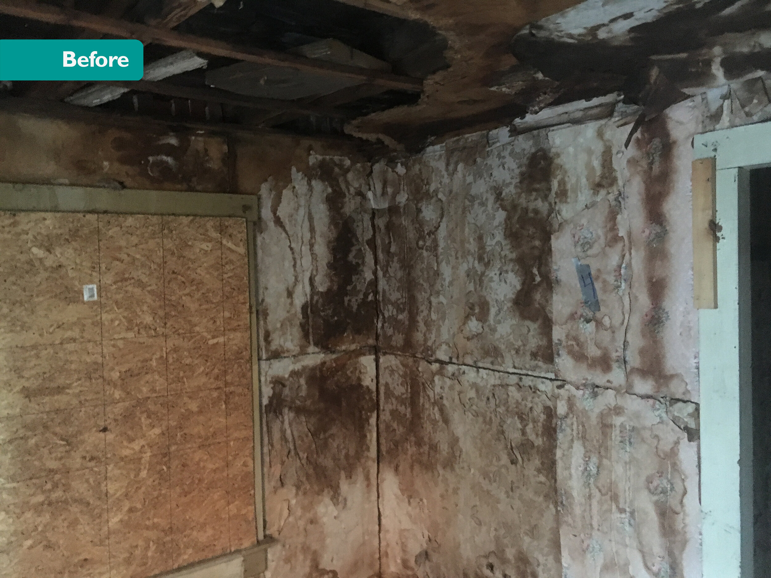
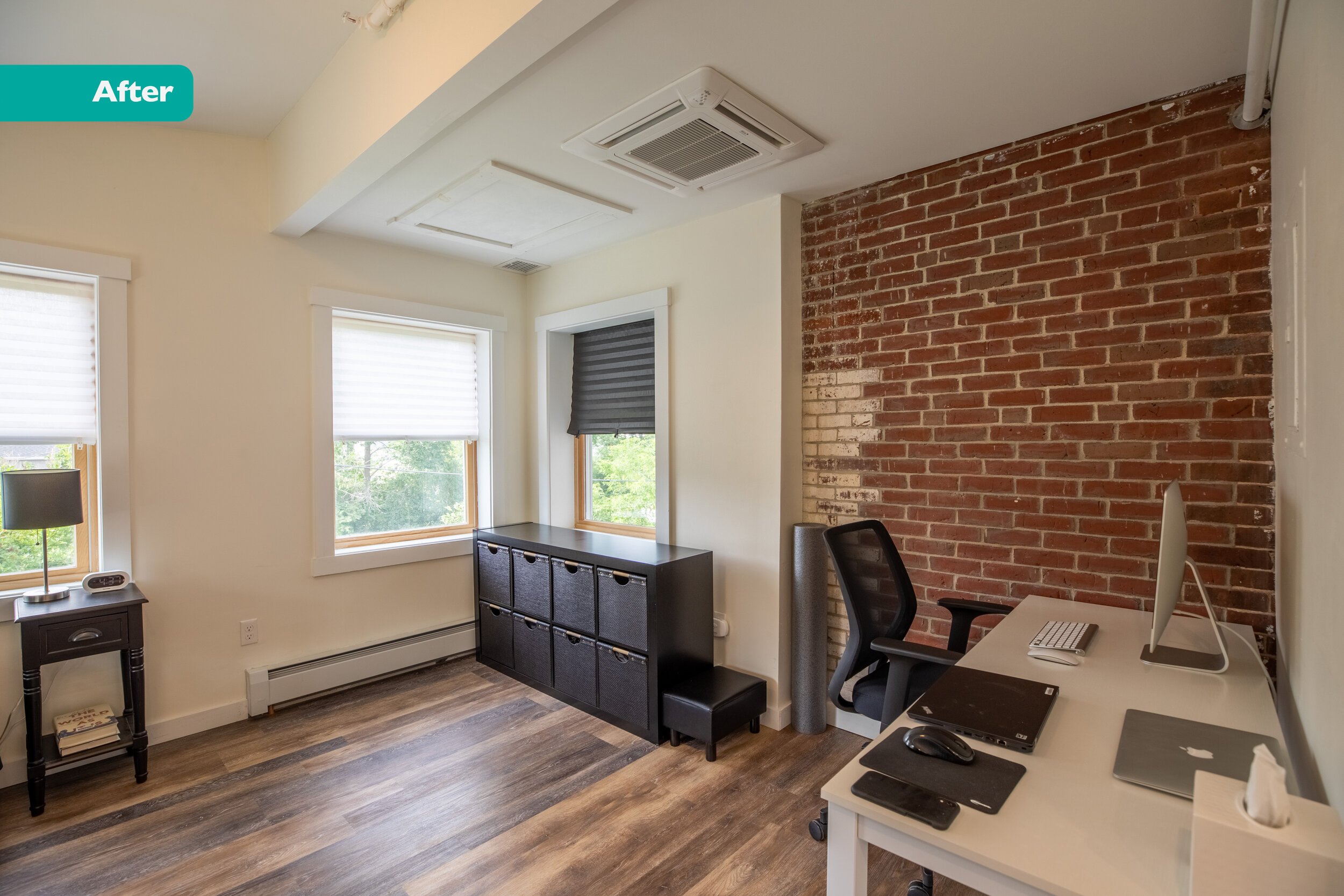
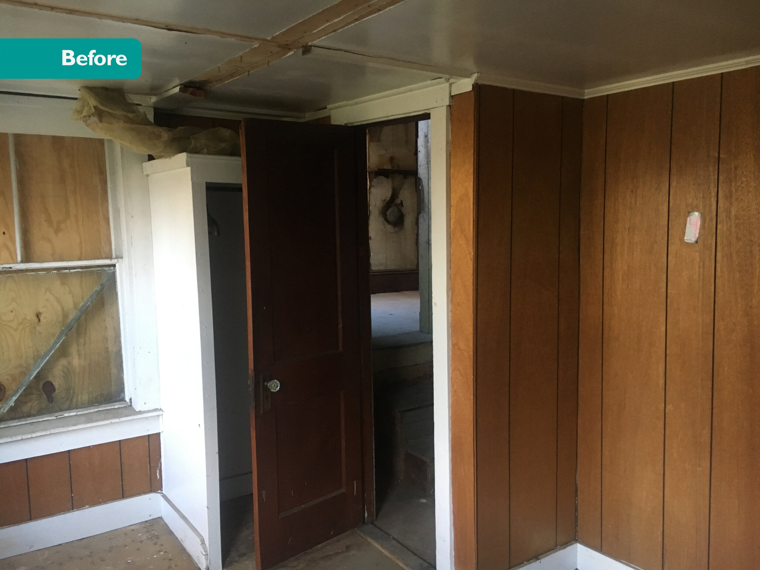
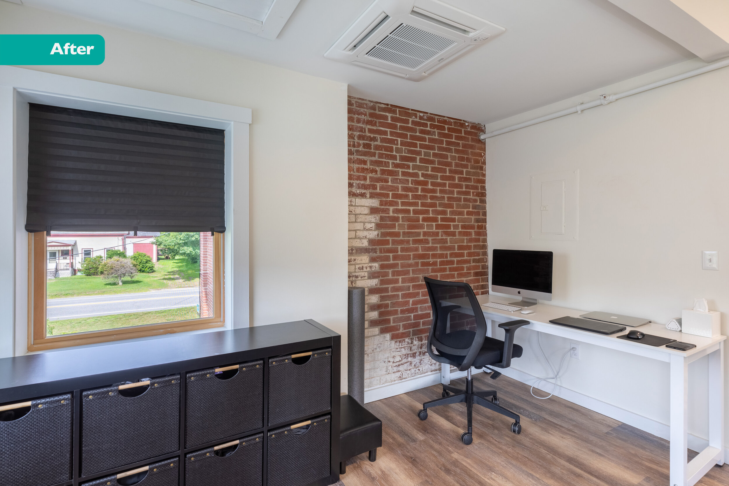
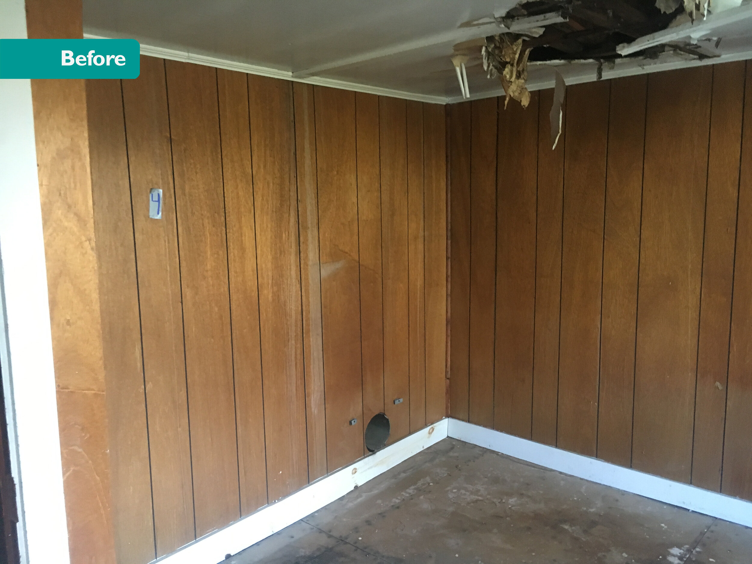
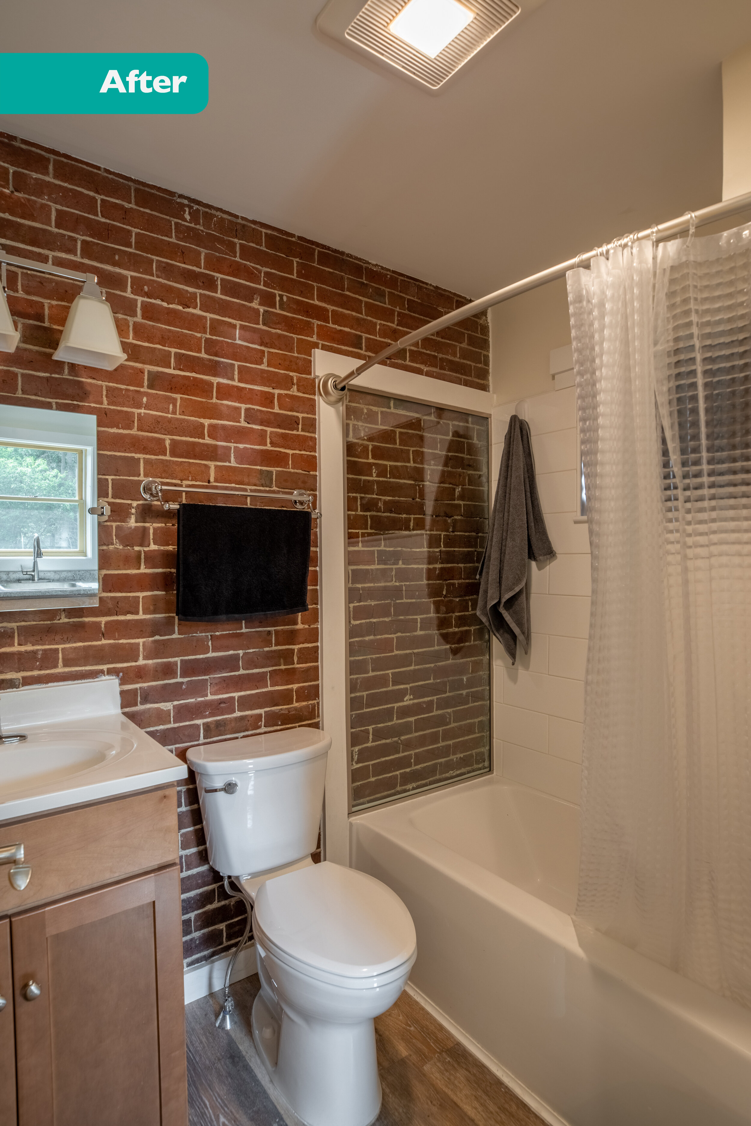
You may remember that I wrote about a few of these units last December. Well, we finally got back on site to finish up the photo shoot. Once again, the before/ afters are MIND BLOWING. Plus, units 2 and 7 are furnished! It’s cool to see how tenants are actually living in the spaces.
Here’s the gallery of the whole project. And here’s a summary of what I wrote about this project (one of my favorites to date)…
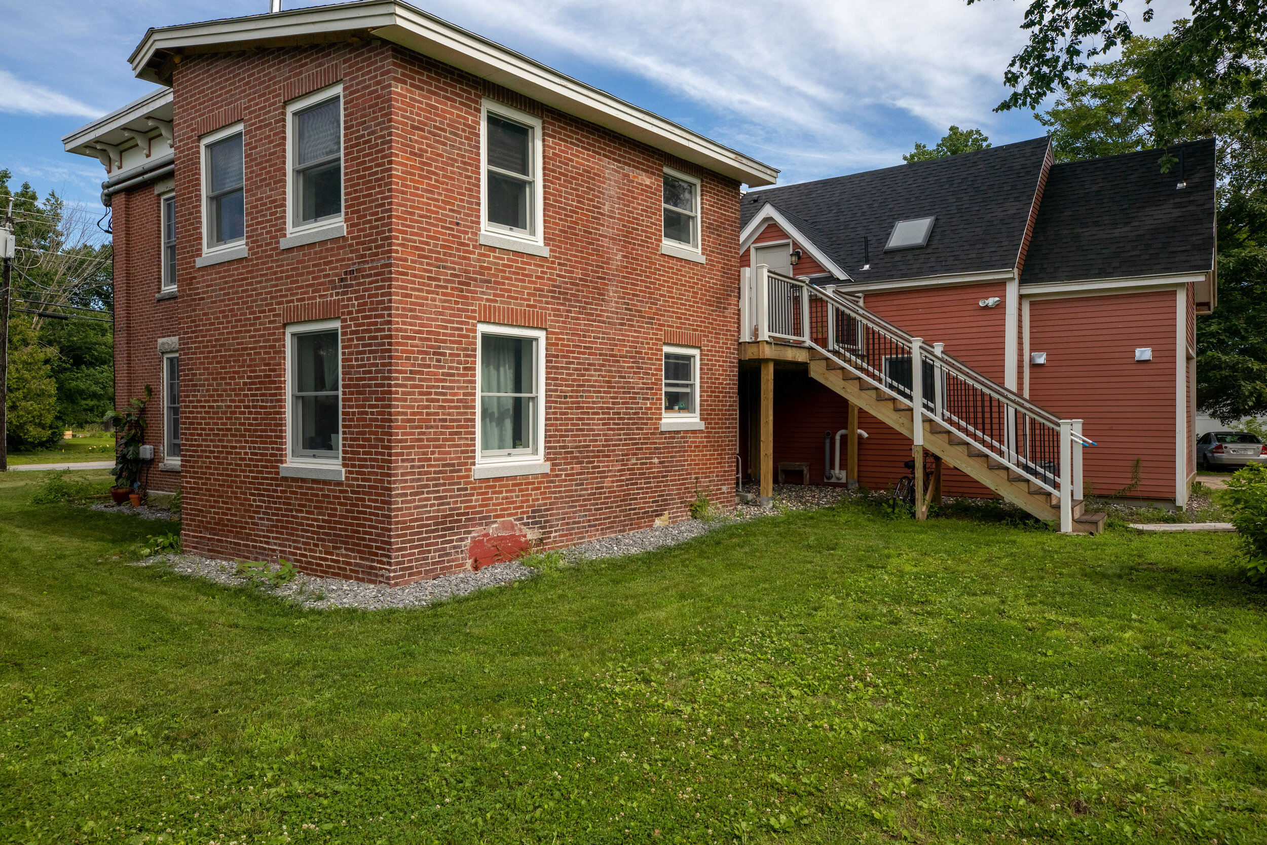
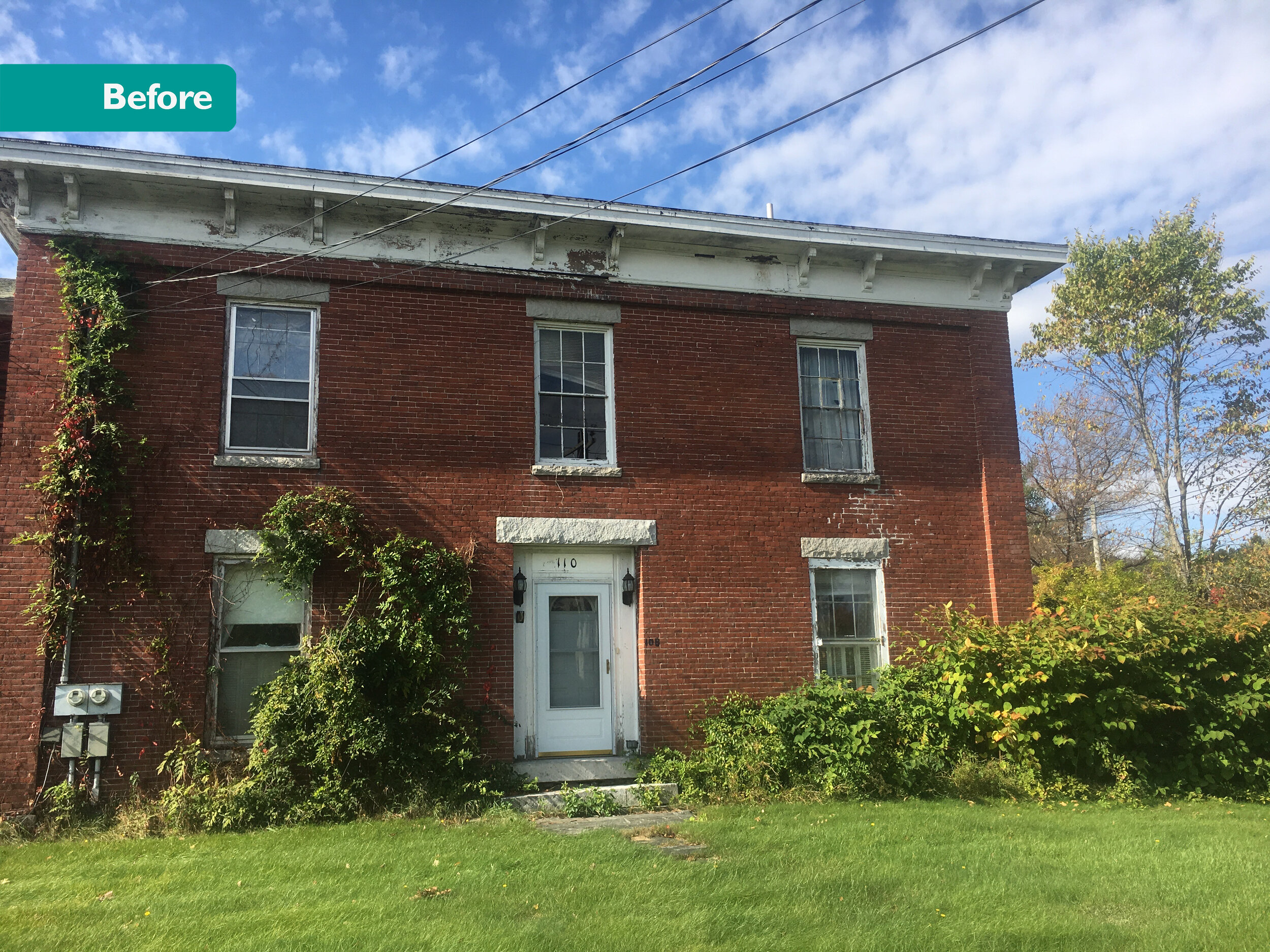
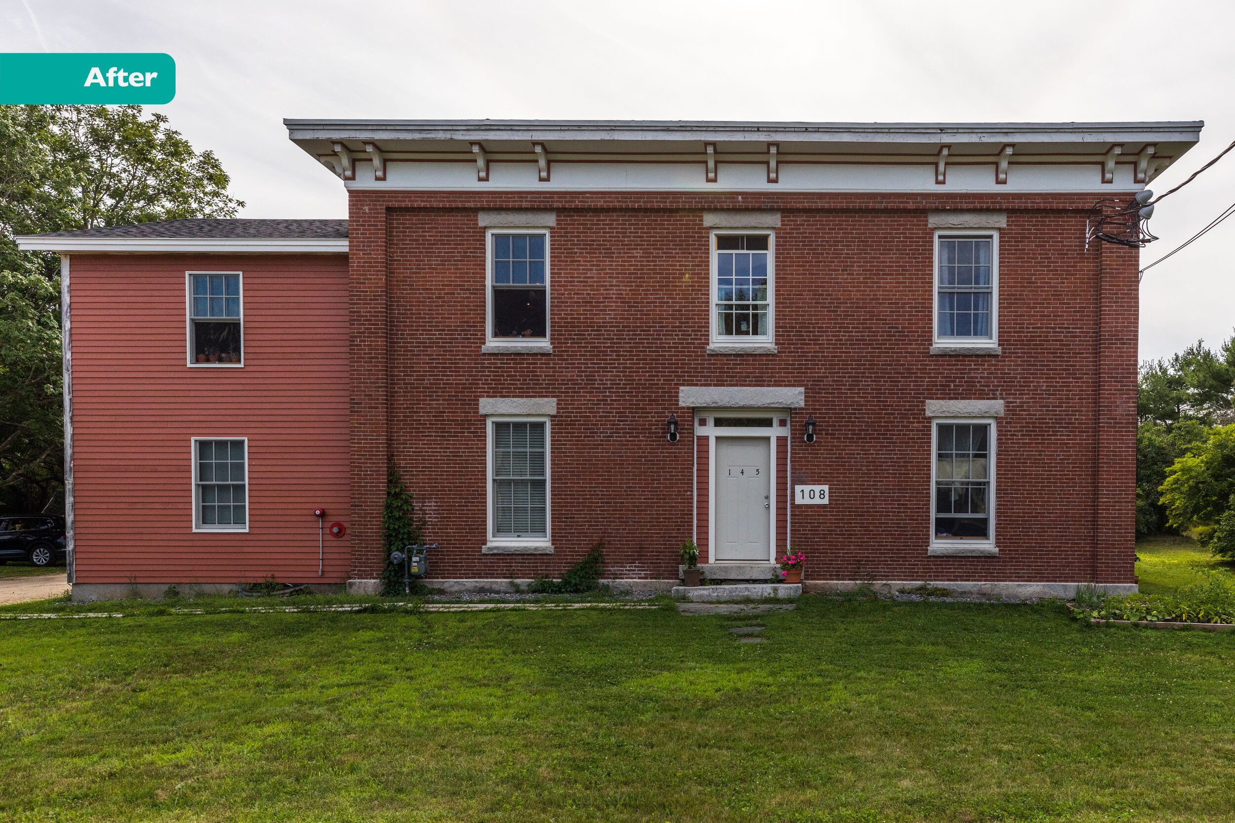
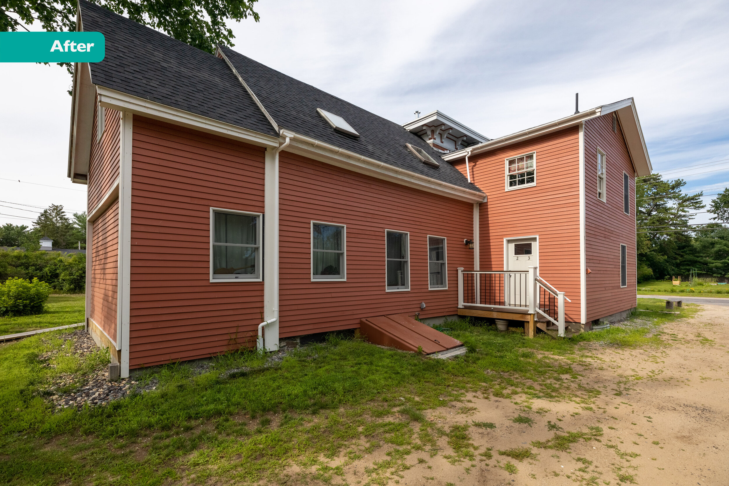
My friend Ben bought a big brick building in very rough shape. Despite its deteriorating condition, the bones of this place were spectacular, the potential was enormous. Huge windows. Fancy, hand carved exterior molding. It was built circa 1830 for a wealthy merchant family.
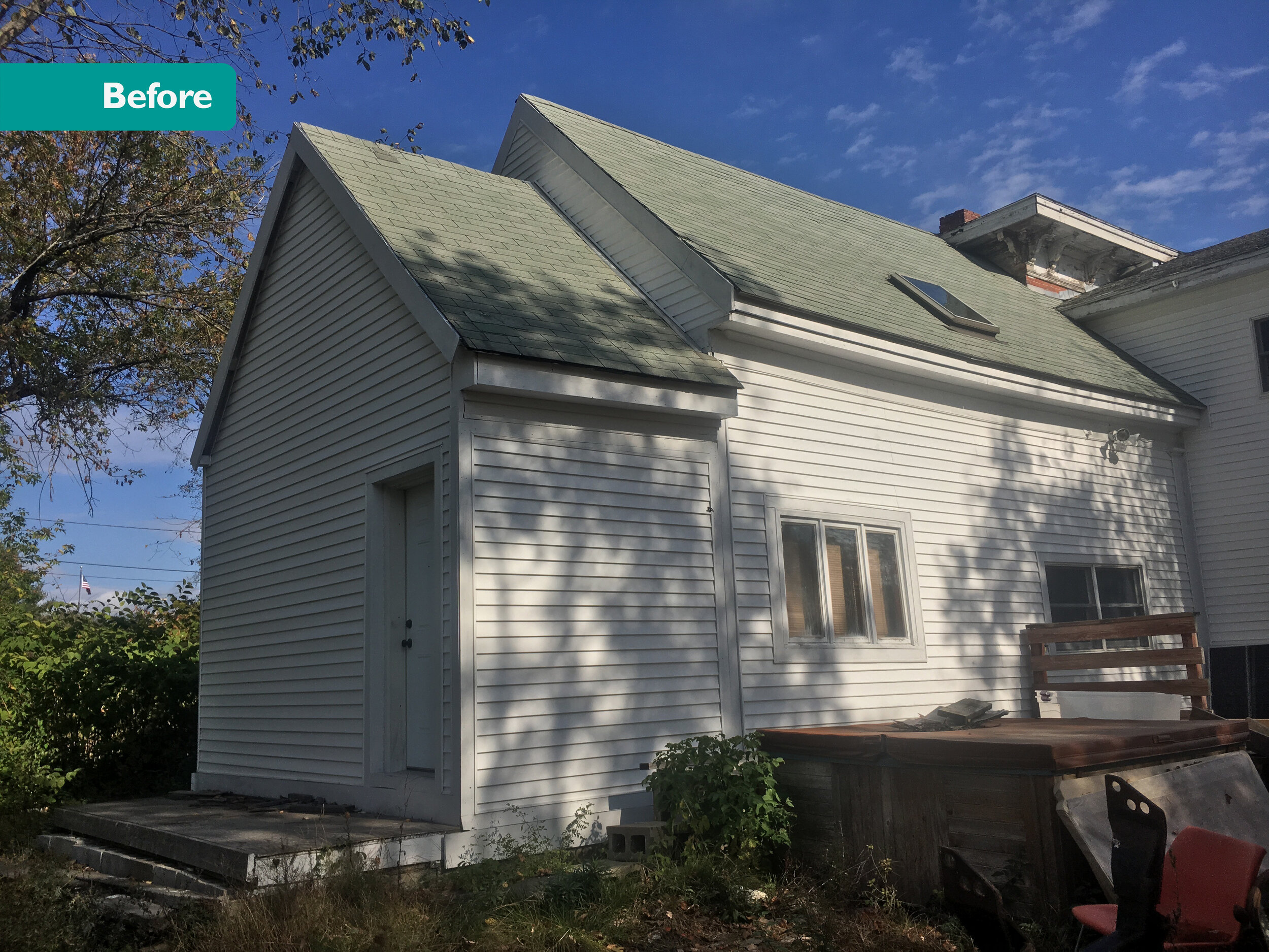
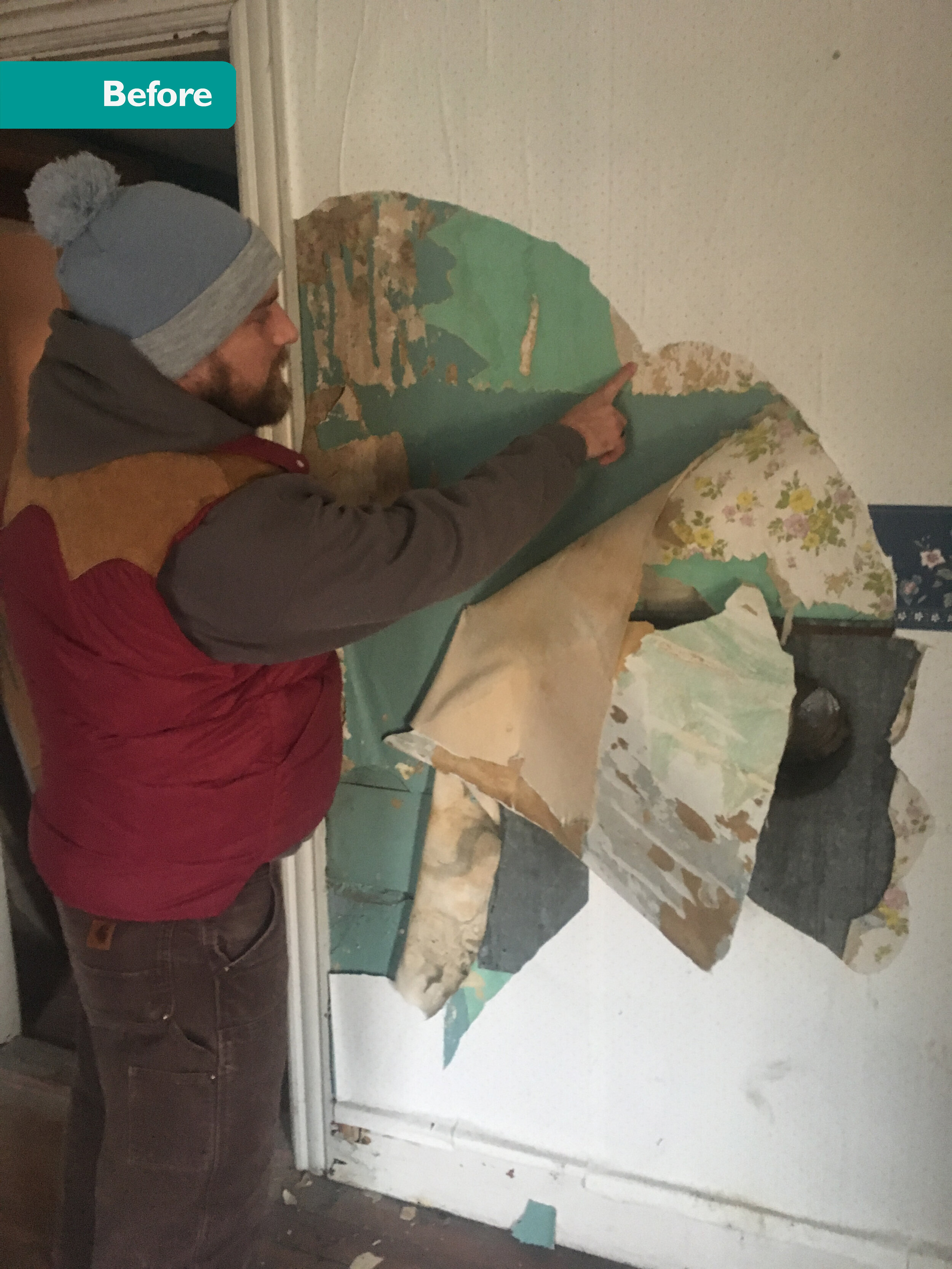
When the contractor demo’ed the interior walls they found an old ledger for Coffin’s General Store. There were entries dating back to 1826! Apparently the owners of the Brick House used to cut and sell ice from the large back yard; first selling it to restaurants and then selling it at the General Store. In the 200 years since it was built, various inhabitants tacked on four different wood frame additions. In one room Ben peeled back seven layers of wall paper.
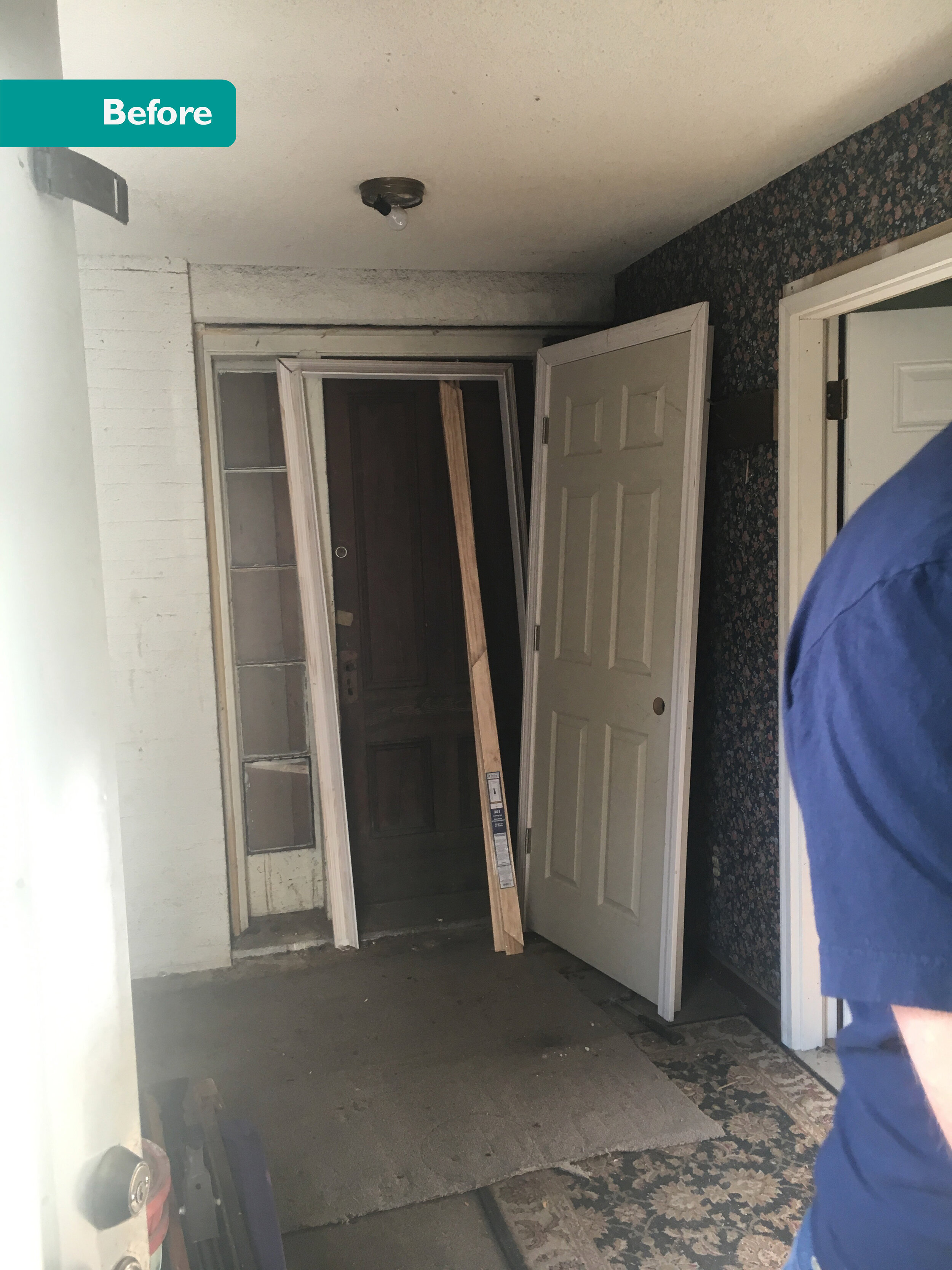
We think it was three different apartments but it’s hard to tell. Lots of weird rooms and oddly placed doorways. Kitchens tucked into closets. In one unit, the oven hood vented into the upstairs apartment which had fire damage (surprise!). In one unit, the fan was low enough to injure a child! This place was truly a sight to behold.
We set about restoring this majestic brick beauty by turning it into seven micro-apartments. Here are the proposed Floor Plans:
Style
Minimalism with a traditional touch.
Photos!
Exterior & Common Spaces
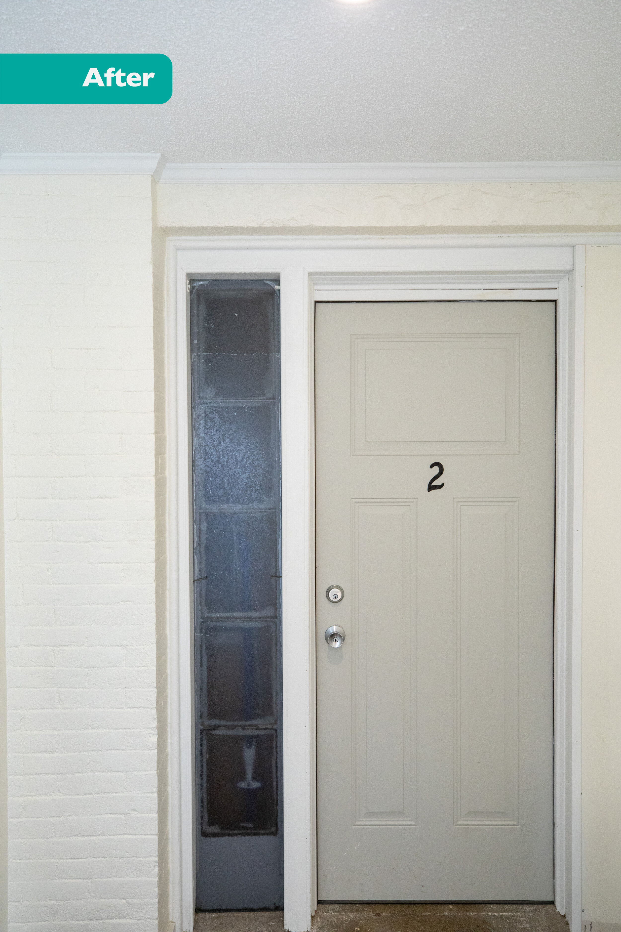
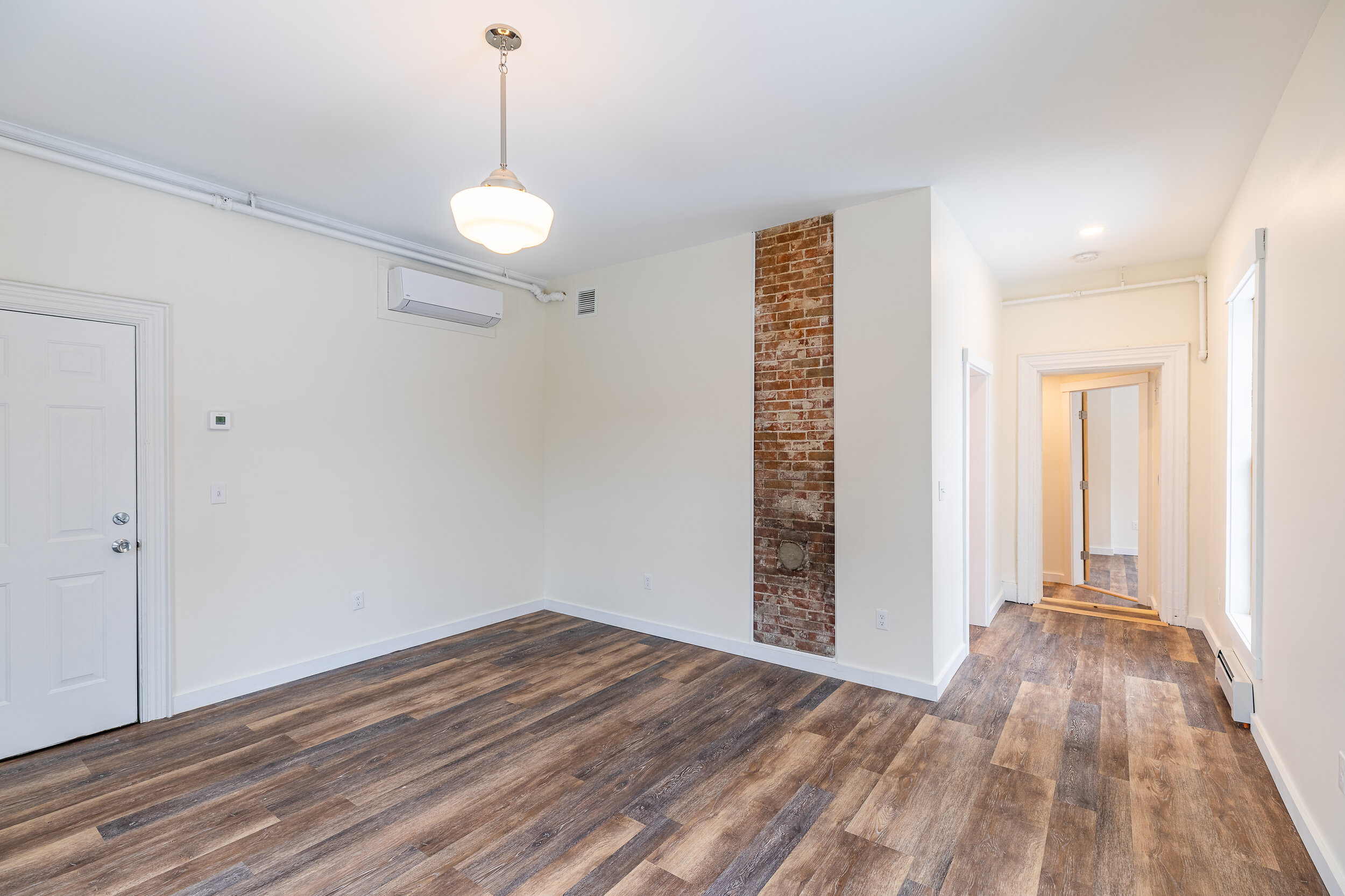
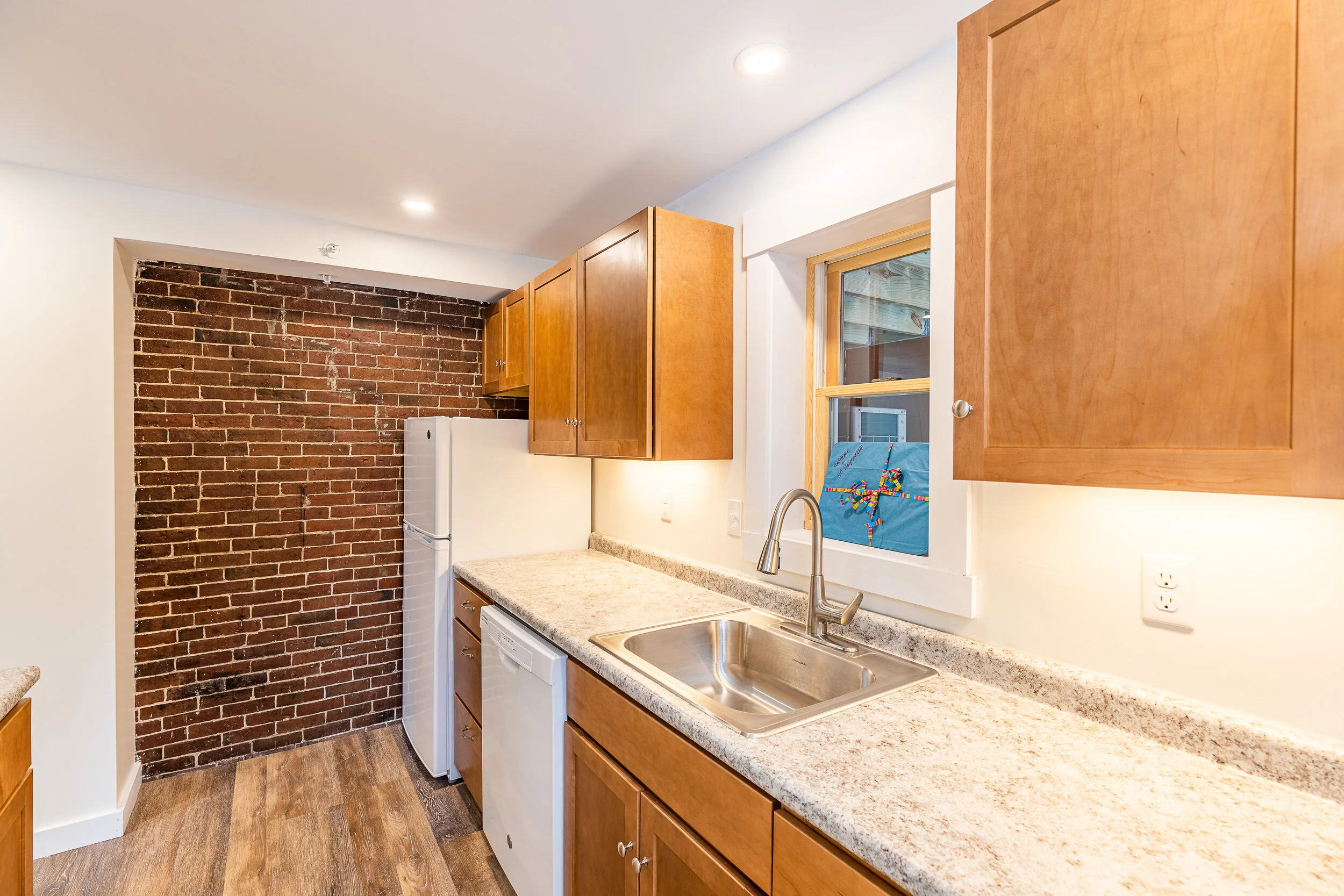
Unit 1
579 SF
1 Bed/ 1 Bath
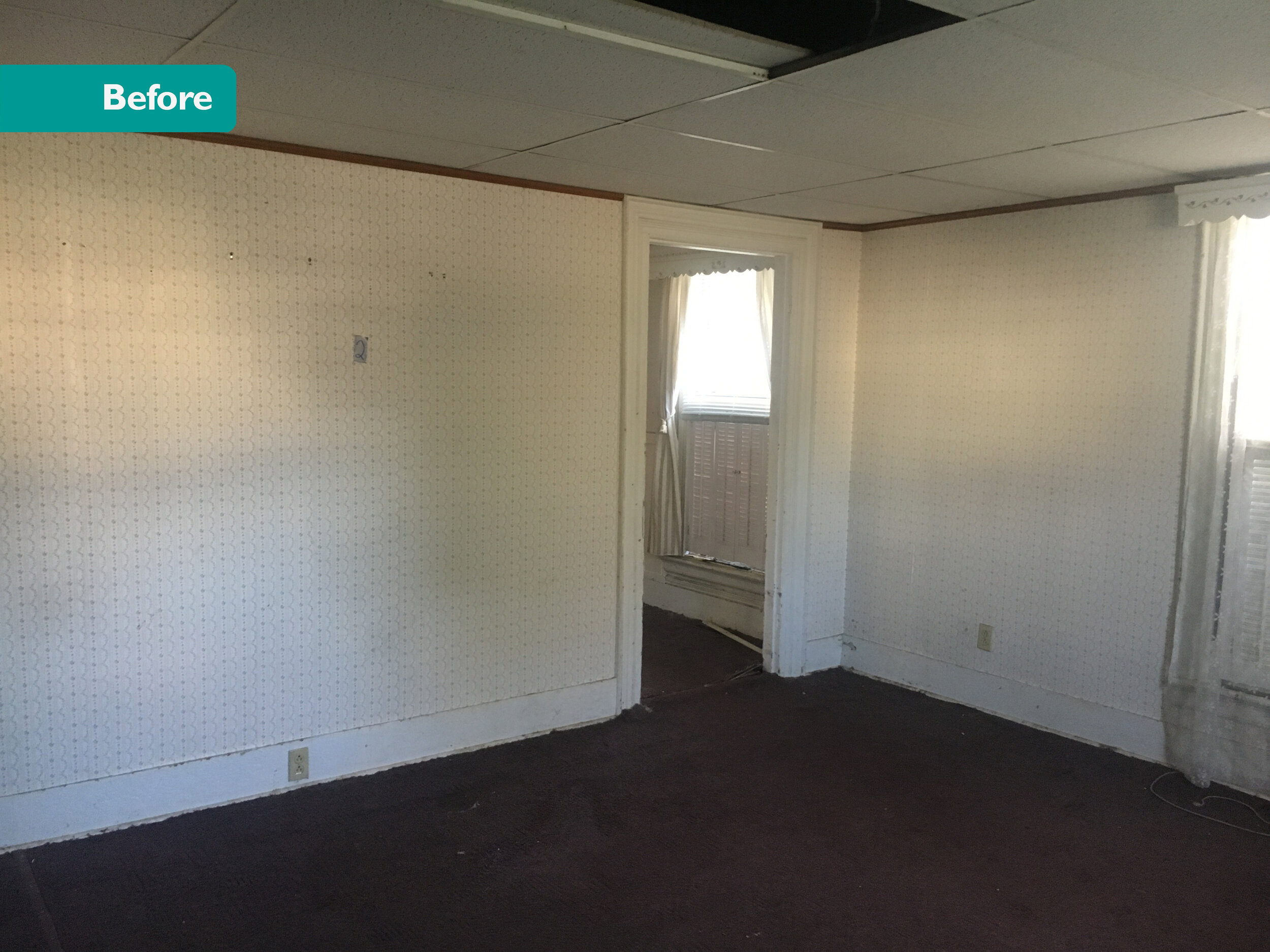
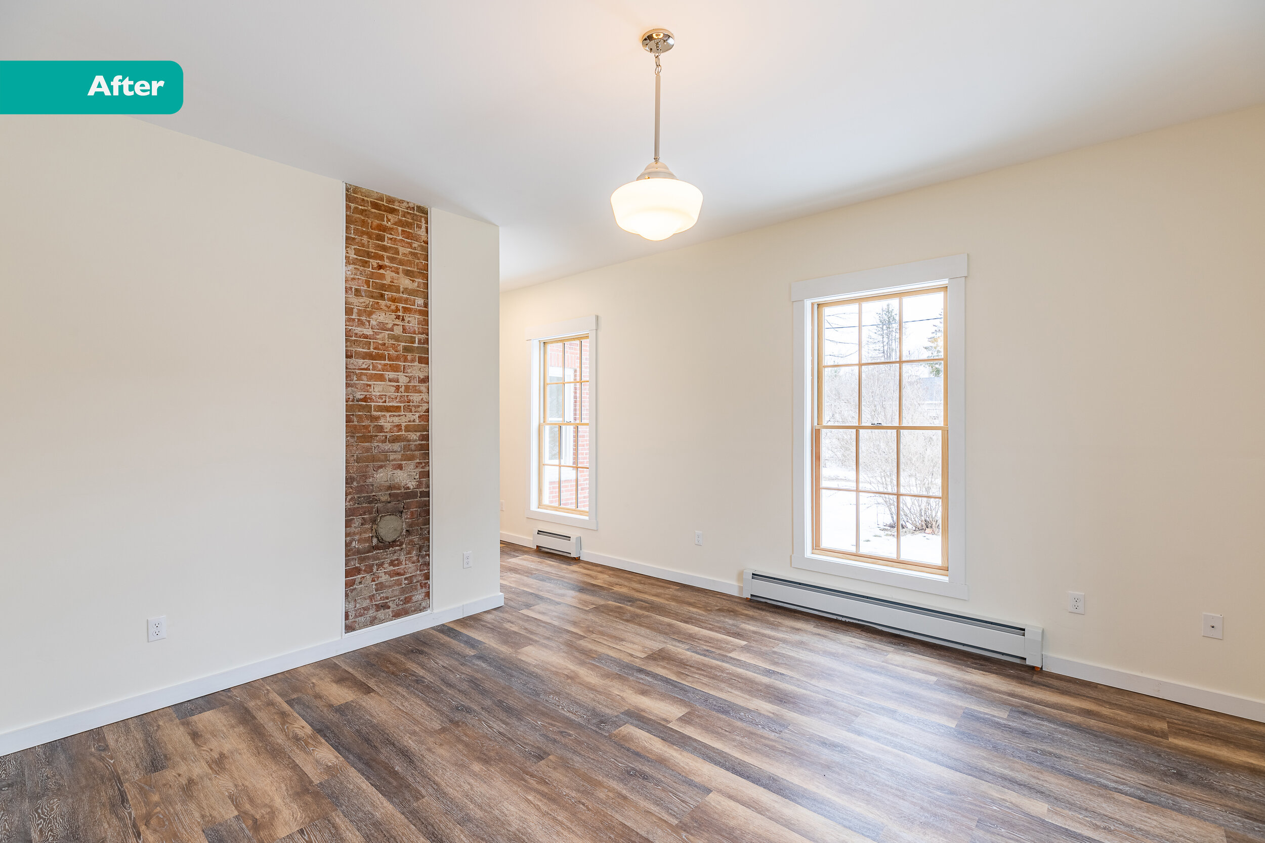
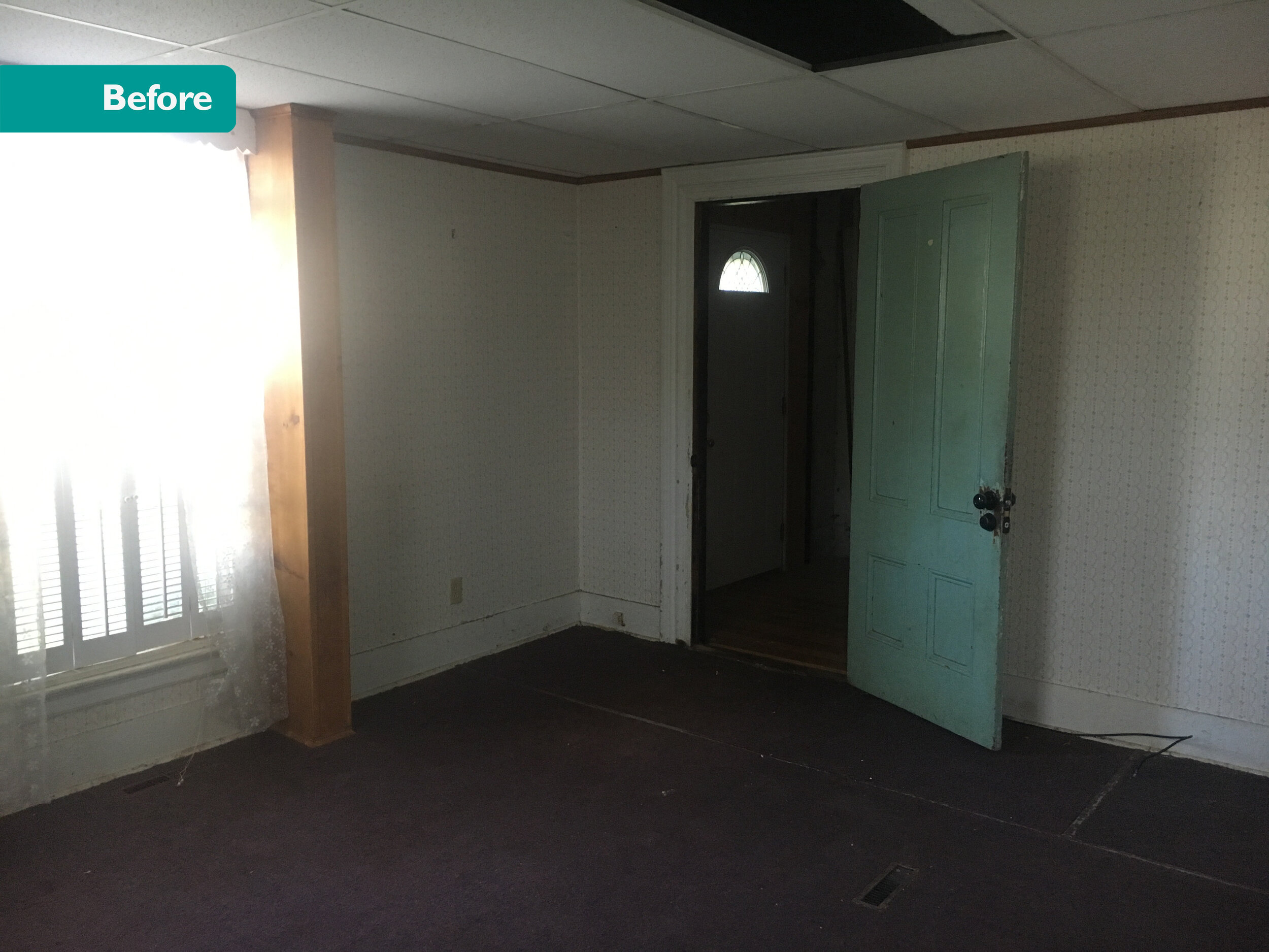
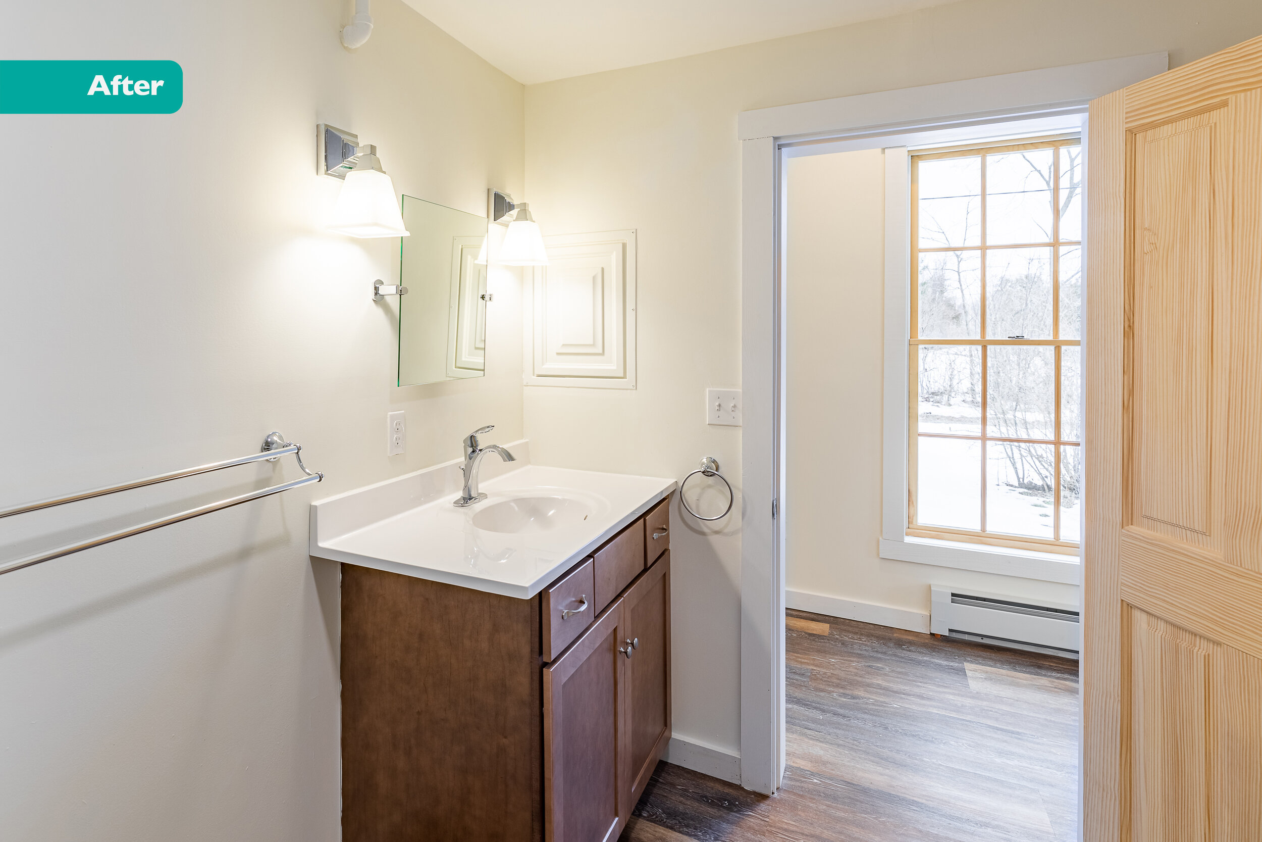
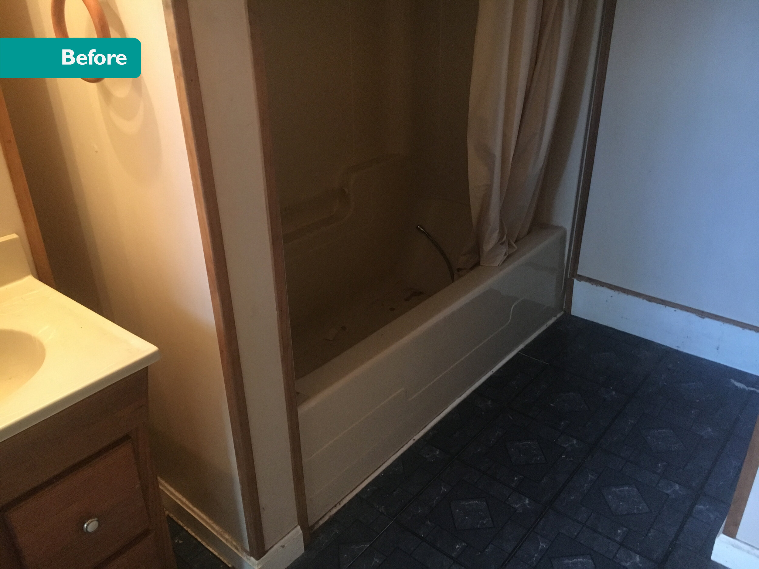
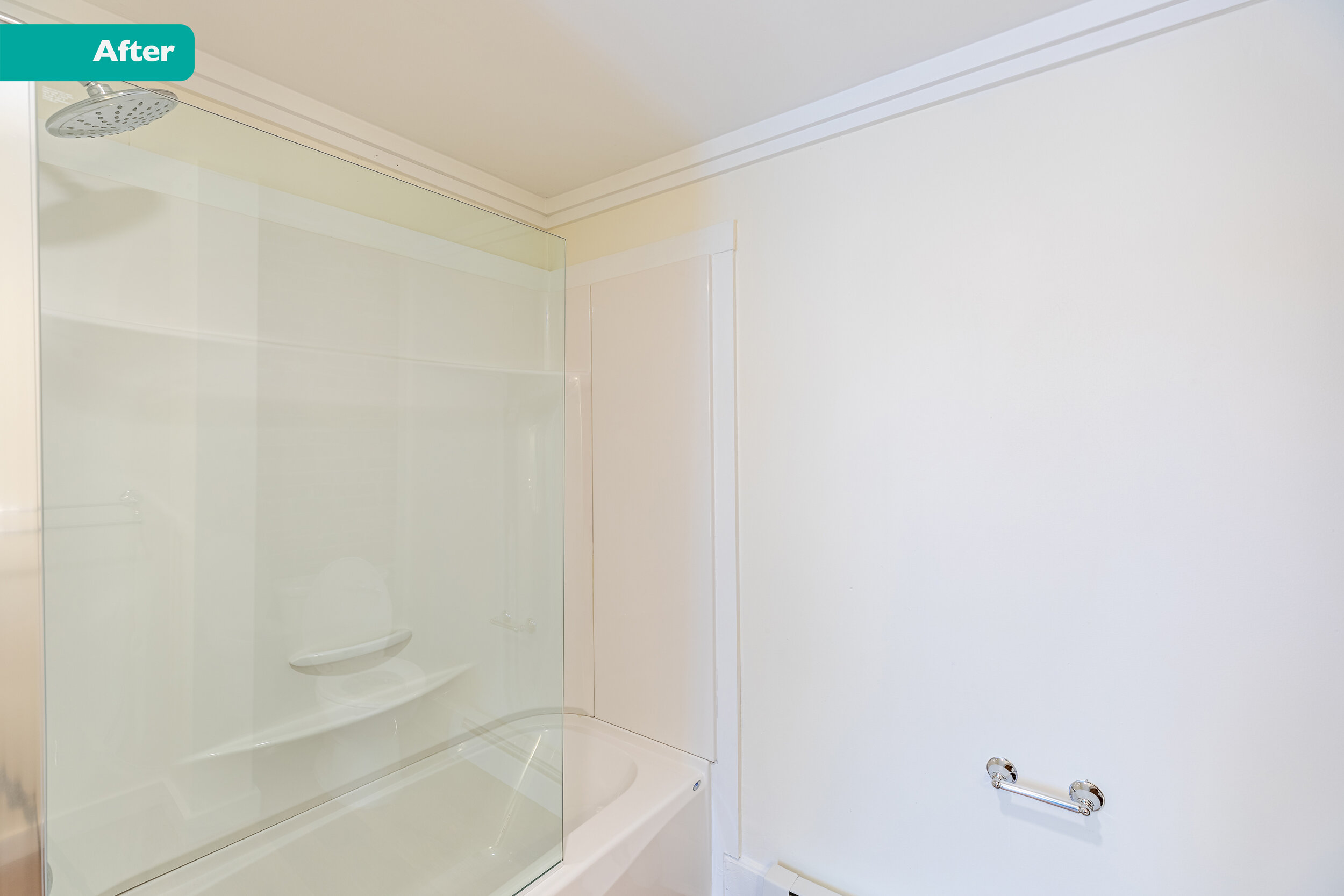
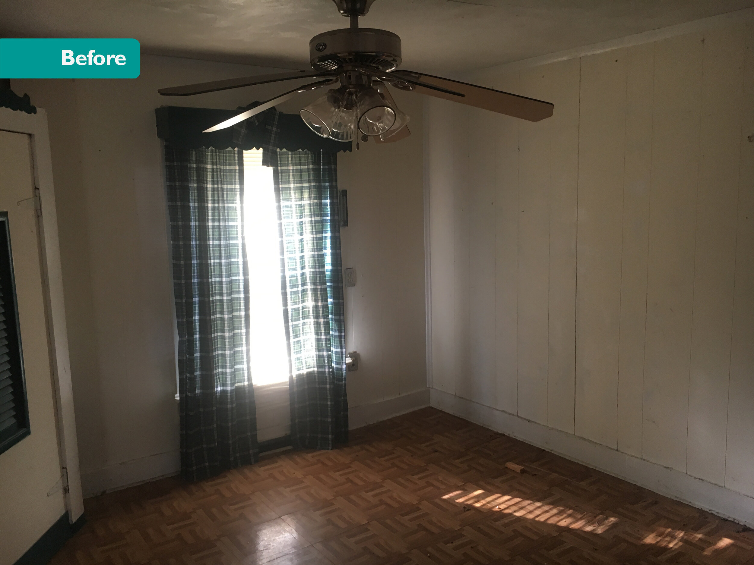
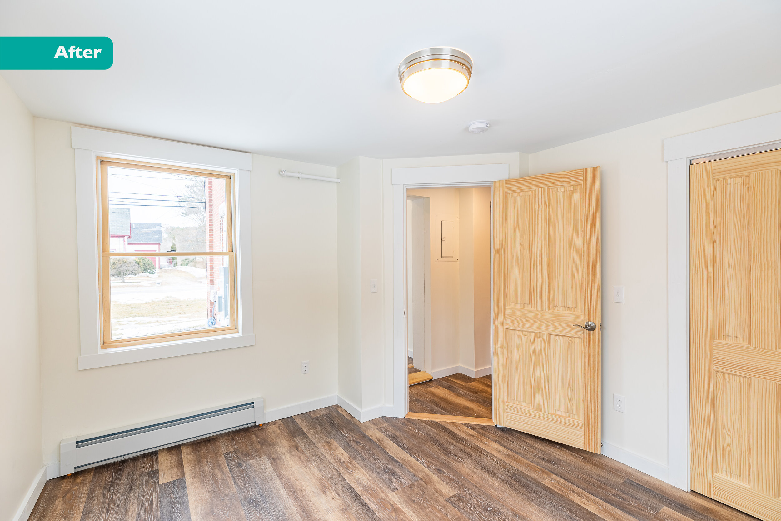
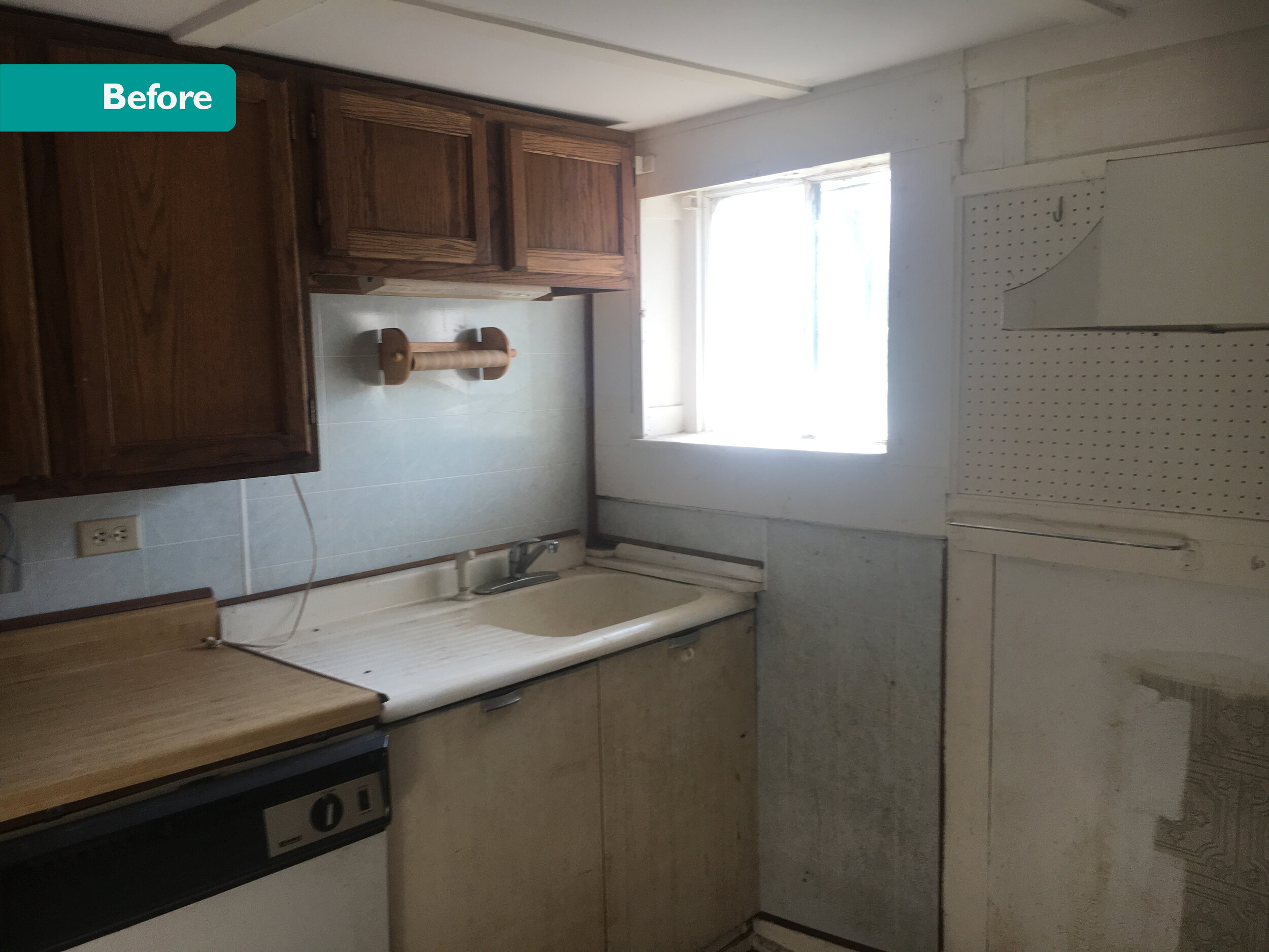
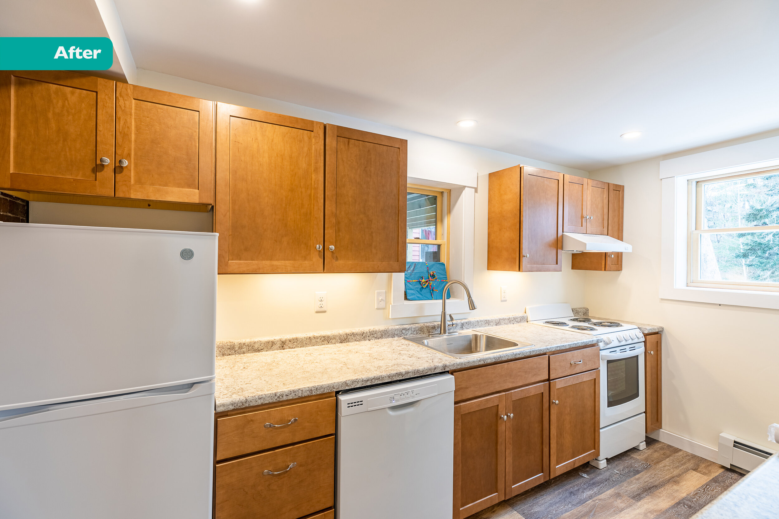
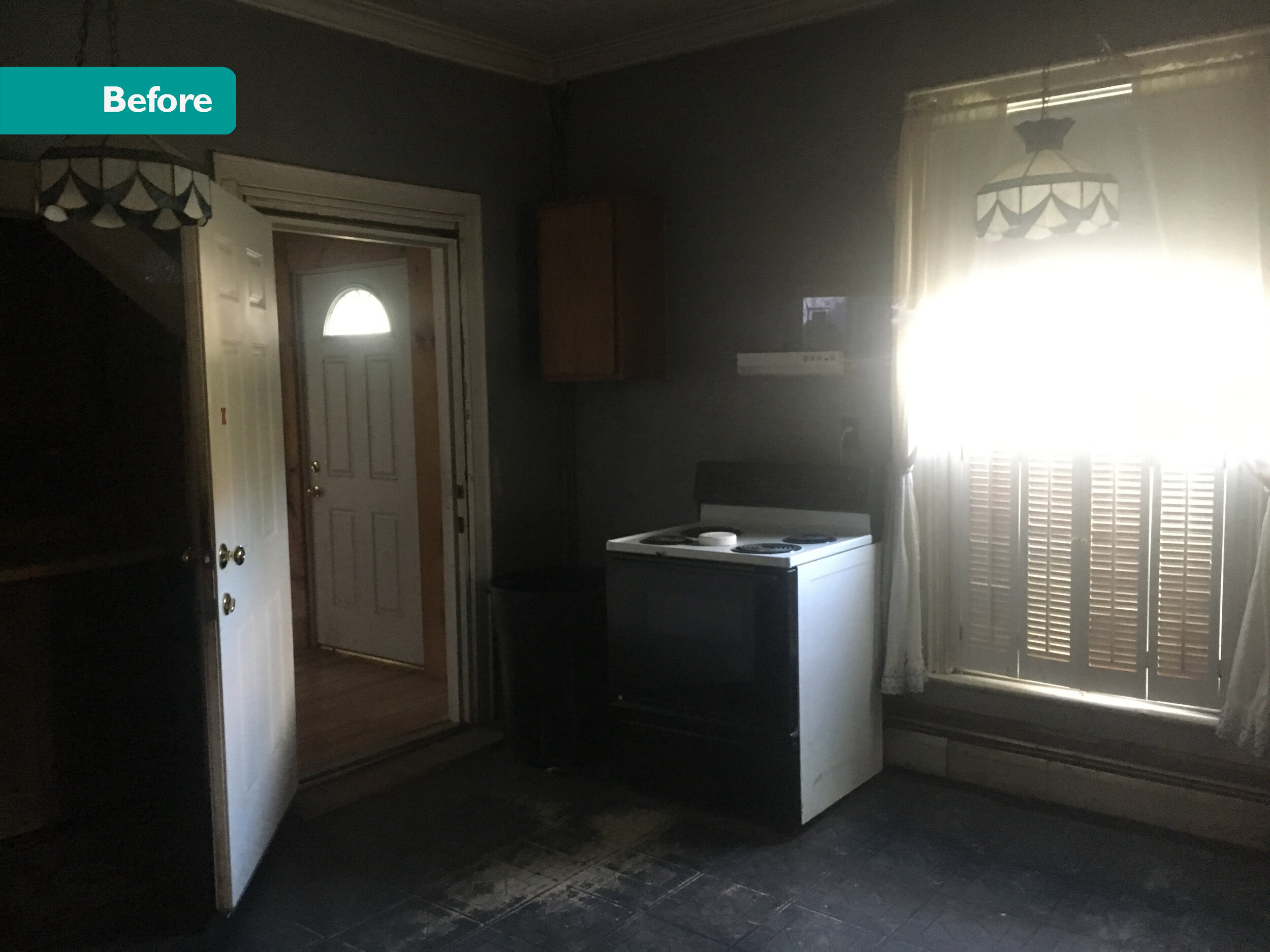
Unit 2
594 SF
1 Bed/ 1 Bath

Unit 5
703 SF
2 Bed/ 1 Bath (the only 2 bedroom in the building)
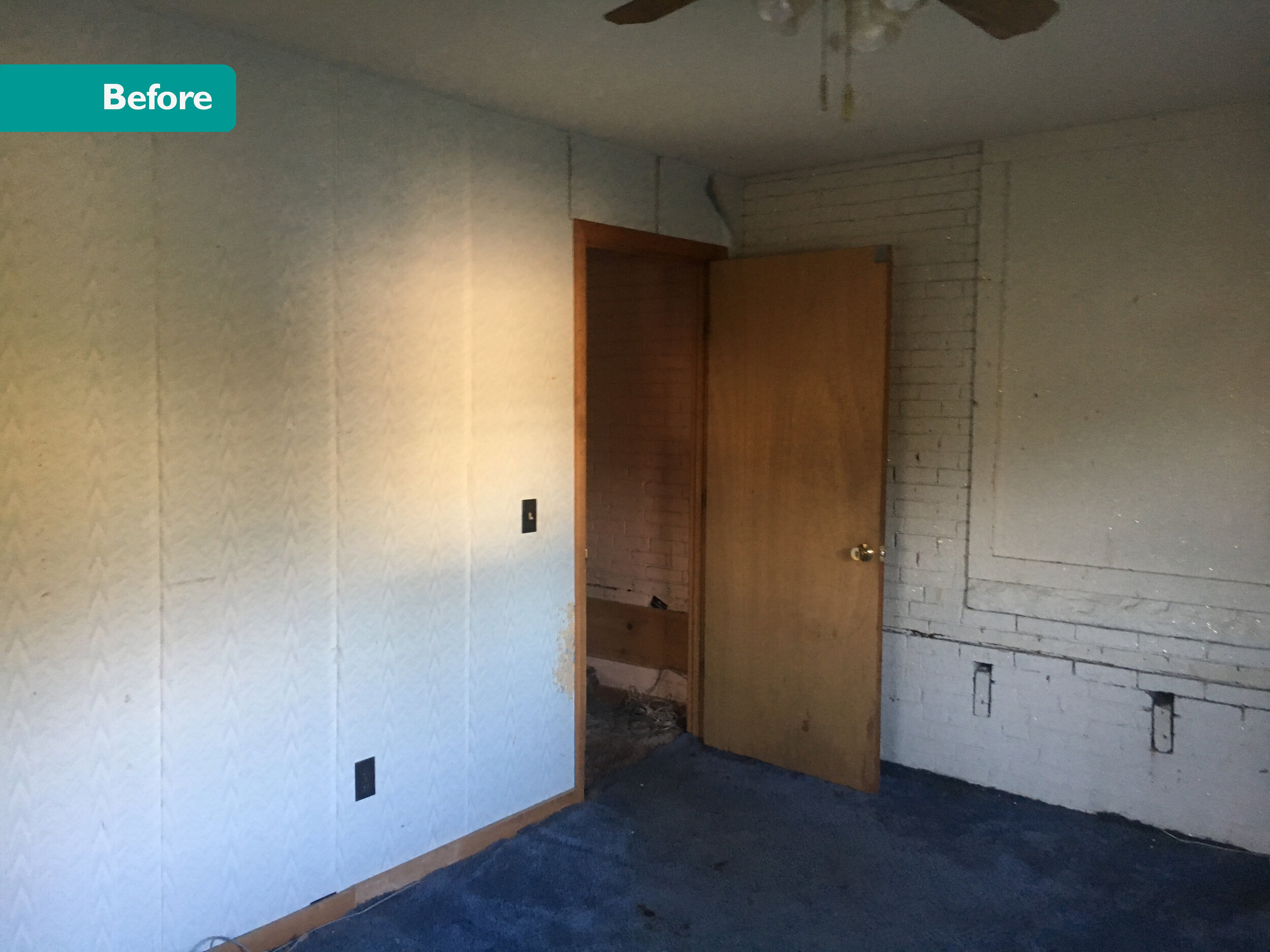
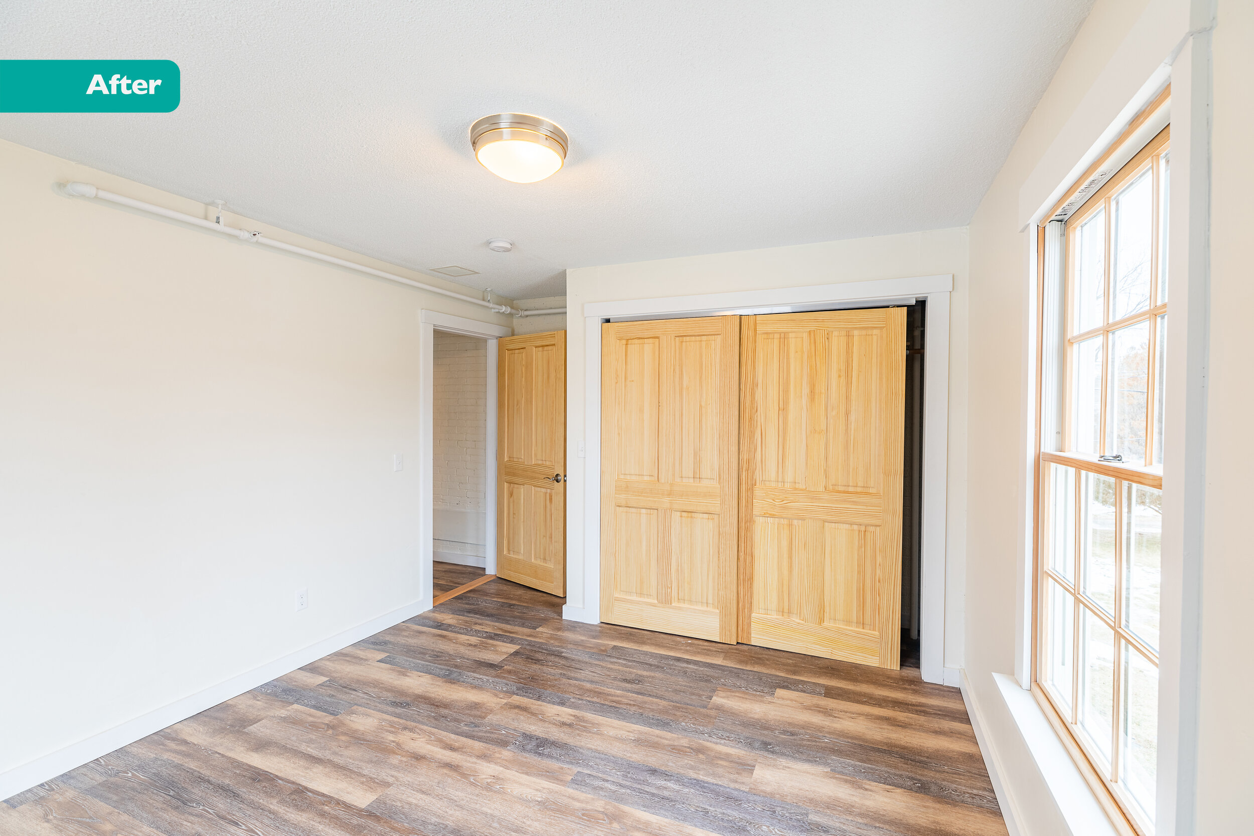
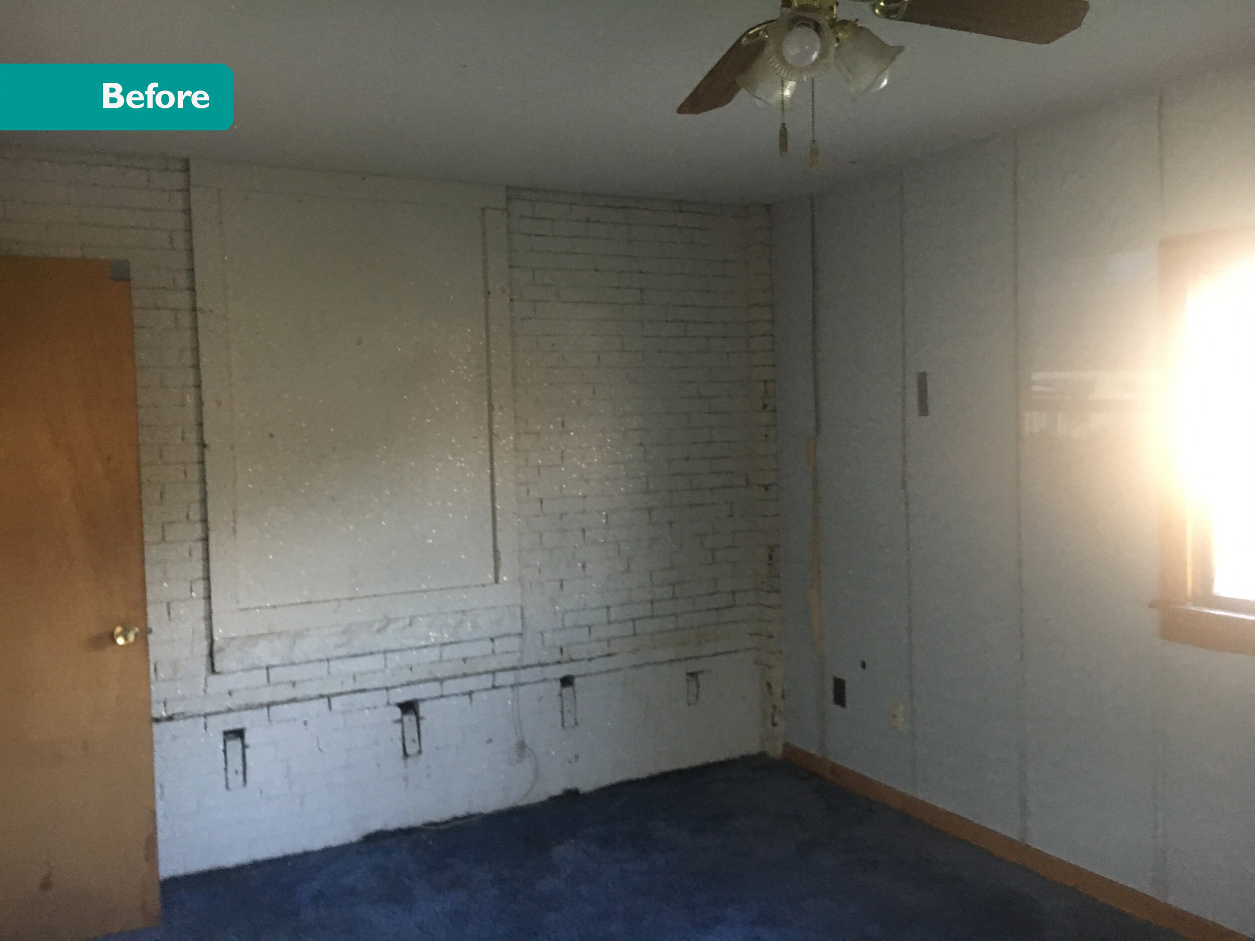
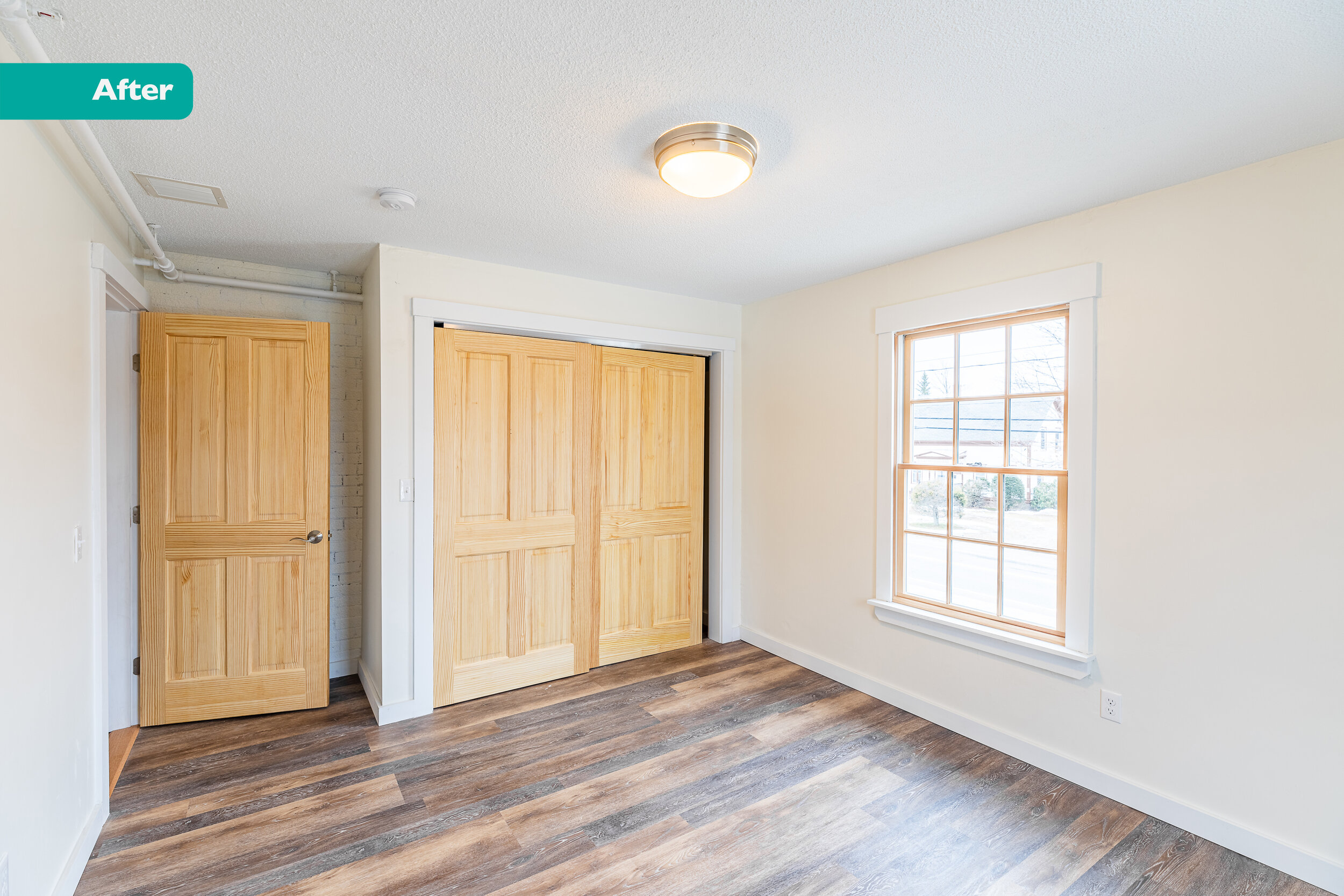
Unit 7
238 SF
Studio (the tiniest unit in the building)
Units 3 & 4 & 6
Check out the gallery page with all the units. Here’s the link.
Priorities
Ben wanted the best bang for his buck. Seven units in what used to be three units. And make it look good. And function well.
Work Done
We maximized space by raising ceilings, opening up rooms, and changing circulation paths. This, plus more windows and fresh new finishes helped brighten the spaces.
We modernized the building by adding mini-splits with backup baseboard heat.
We hired an enclosure consultant to help figure out what to do for insulation. The walls, roof, and basement/ crawl space were insulated & sealed with closed cell spray foam. It keeps the heat and moisture in (or out).
Then, this part is very important, we installed an ERV (Energy Recovery Ventilator) system. We have a well sealed building and it needs fresh air. An ERV supplies fresh air and removes old air. Yay for clean air!
This place has all new energy efficient appliances, LED light fixtures, and efficient plumbing fixtures. They replaced windows, painted trim, and re-roofed.
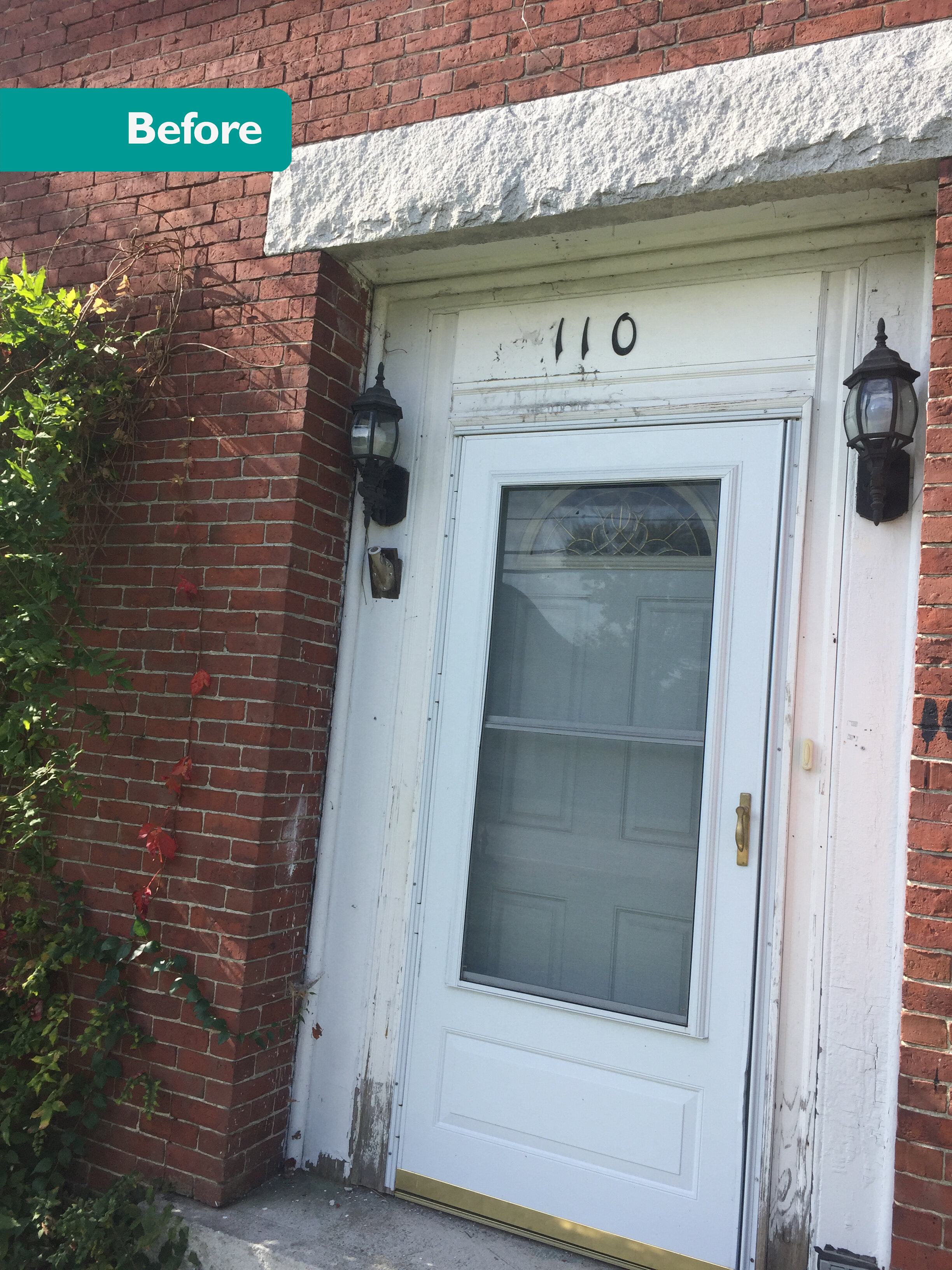
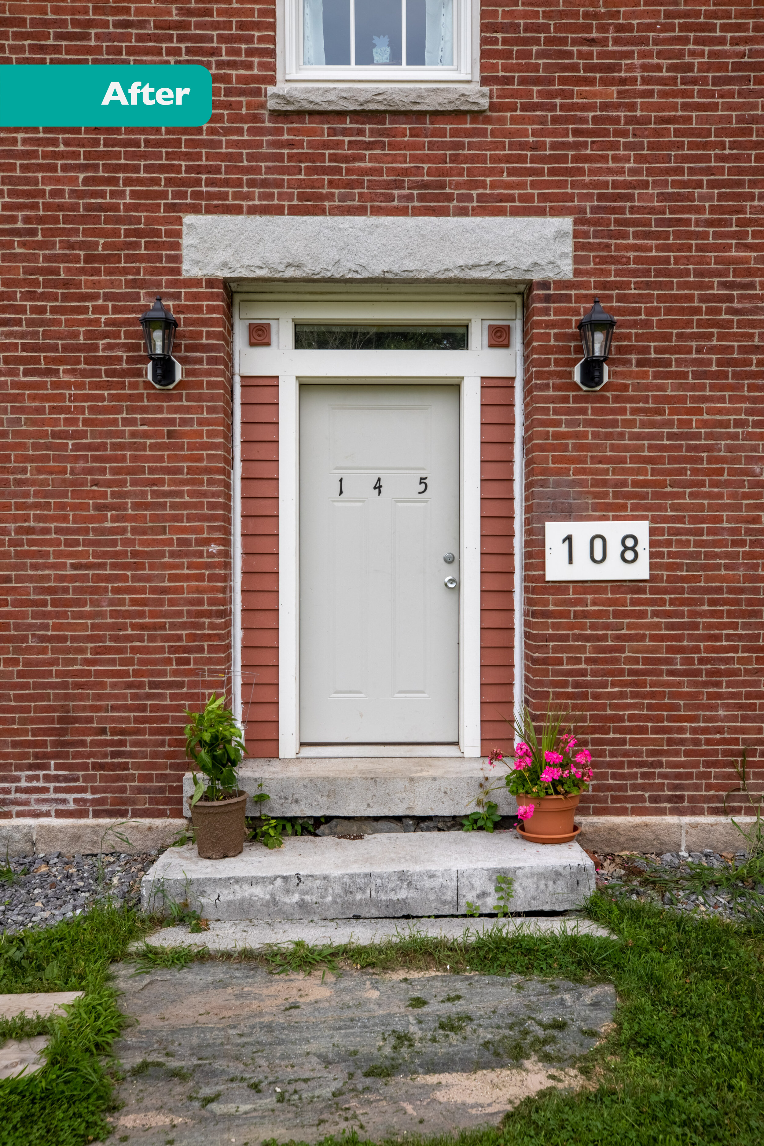
But that’s just the tip of the iceberg. The contractor leveled floors, removed staircases, and moved mechanical equipment. There’s still an old wood furnace in the basement that was too heavy to move. There was extensive masonry repointing, replacing granite window sills (which were originally sourced in nearby Rockland), and replacing entire brick walls. This place was old and neglected.
And now this baby shines.
My Favorite Detail
My inner archie-nerd loves the new insulation and ERV system. Most clients think it’s unnecessary and that’s probably the most depressing part of my job. Why build a house that will turn into a box of stale, toxin-filled air in the winter? It feels great to know that people living in this building will breathe filtered, temperate air.
BUT, my designer side loves the new red trim at the crown of the Brick Mansion.


