DIY Design: Where To Put Furniture
5 steps to create a comfortable and welcoming space.
Interior designers are fantastic at space planning. Most designers can turn a cramped, claustrophobic room into a spacious, safe haven. I want to equip you with the basic tools to feel the love in your space. I want you to be your own designer!
Ashley's Guide to Furniture Placement.
1. Make it a board game!
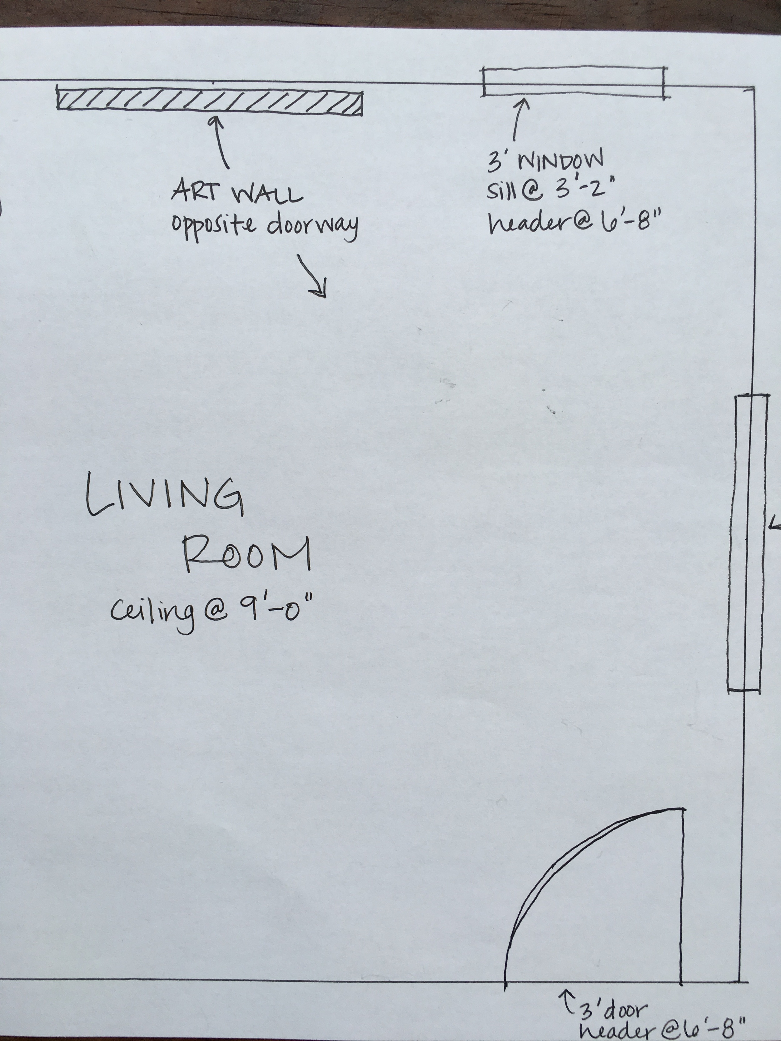
Take measurements of the rooms and use a ruler to sketch it out on a piece of paper. You can use a normal ruler. Draw so 1”=2’-0” and write in the dimensions.
Using a new piece of paper, measure and sketch all your major furniture. Then cut all these furniture pieces and voila! You can use these pieces to easily “rearrange” furniture.
Don’t forget to show windows and doors!
2. Focal Points.
Place large furniture first. Locate the best view or focal point of the room and orient large furniture towards that.
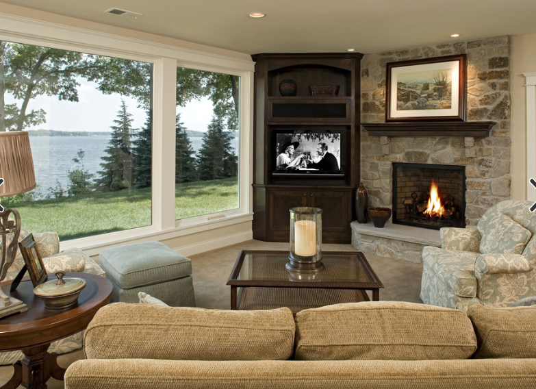
If there’s more than one focal point (like a big picture window AND a TV), combine them. Put the TV in the corner next to the window.
If the focal points are immovable and totally separate, angle your seating to see both. Get an L-shaped sofa or a sofa and single-person chairs. Even better, get chairs that swivel!
(Above: living room with THREE focal points. Stonewood LLC solves the problem with seating at all different angles. Perfect!)
Note about narrow rooms: It can be challenging to find a workable focal point in a long, narrow room. You’ll almost certainly have to create your own. An art wall, bookcase, TV or fireplace works great. When arranging furniture, load furniture along both long sides of the narrow room. Use most of the middle as circulation space.
(Left: lovely narrow living room by Francesco Pierazzi Architects)
3. Consolidate circulation space.
Circulation space is the area required to use or move around a piece of furniture (or between rooms). Whenever possible, combine circulation space. For example, your table and chairs can back into a 4'-0" walkway. Here’s a list of tried and true circulation clearances:
hallway or walkway - no less than 3'-0" but 4'-0"+ is better
table and chairs – space for chairs to scoot out from the table (or bar) – 3’-0”
crunch corners – tight corners between furniture – no less than 2’-4”
bedsides – room to get in and out of bed – no less than 2’-6” but 3’-0” is better
TV viewing - check online for extensive charts
4. Consider your light.
Natural light should help define your space plan. If you have a medium sized window in one corner of the room, place a reading chair there. If your office has a huge window, put your desk in front of it and be energized by the natural light. Light can help you focus or wake you up, use it to your advantage.
(Left: shabby chic reading nook takes advantage of natural light. Photo by Teri Lyn Fisher)
5. Good first impression.
Place your prized artwork or accent wall opposite the doorway. You want to see the statement pieces as you enter the room. It may seem trivial but first impressions do matter. It will give you (and your guests) and warm and fuzzy feeling when entering the room. This remains with you for several minutes and helps define your experience of the space. Seriously!
What do you have to lose? Get your board game going and see how you can transform your space.


